WASABI ROLL

WASABI ROLL
Client: takara sushi
Design Company: NONVERBAL ,inc.
Creative Direction/Design: Naoya Takahashi
Brand Direction: Takenori Fuji
Photograph: Yasushi Kurihara
Country: Japan
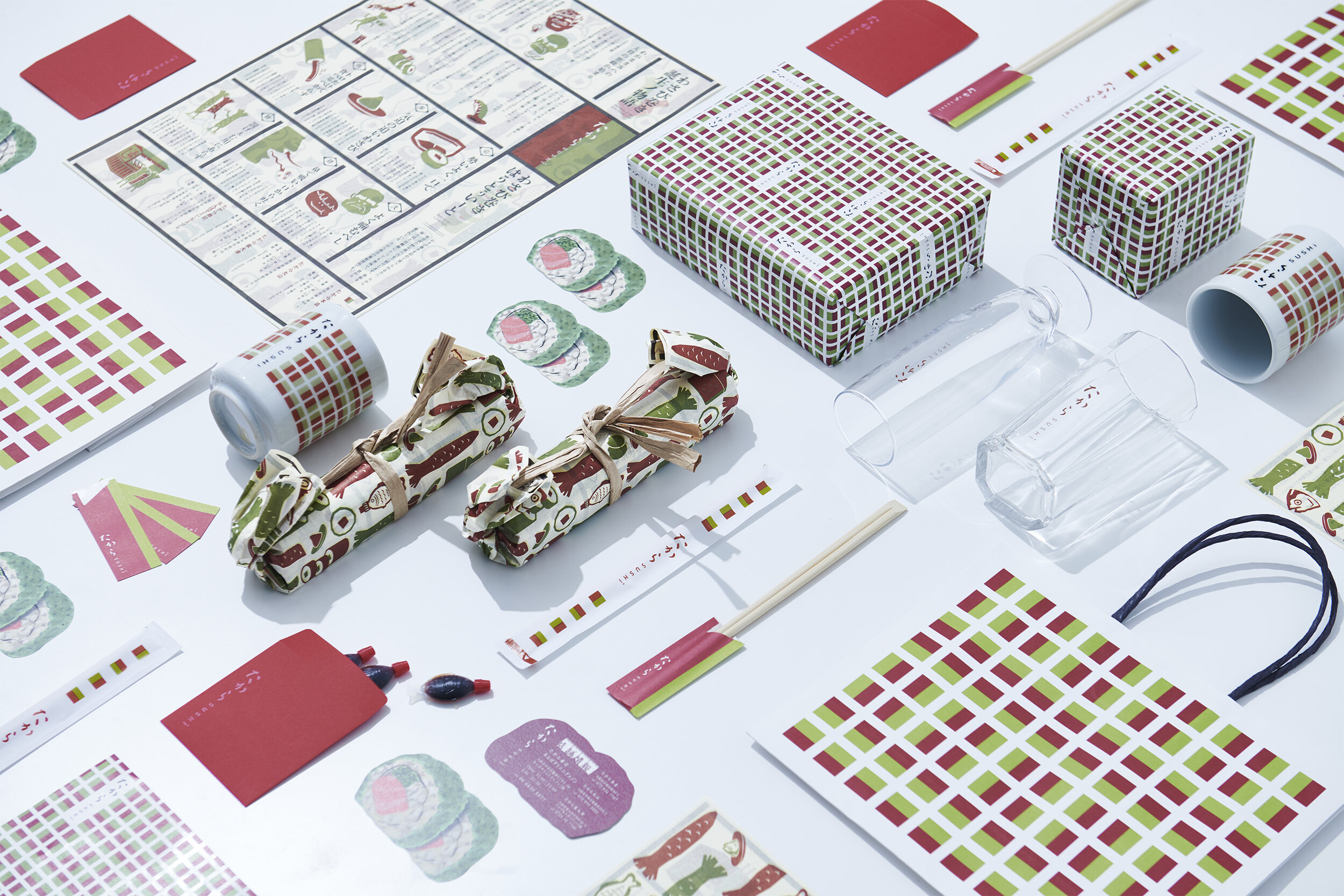
Takara Sushi", a long-established sushi and kappo restaurant loved by the locals since its establishment in Kaizuka, South Osaka, has redesigned its brand image for its new store in the Takashimaya Department Store in the city center of Namba, instead of Kaizuka. Based on the concept of "Onko Chishin" (learning from the past), we inherited the good old elements that have been loved up to now, and sublimated them into a design that is appropriate for the time, place, and people, creating a new impression for new targets and a brand image that is easy to accept for existing customers.
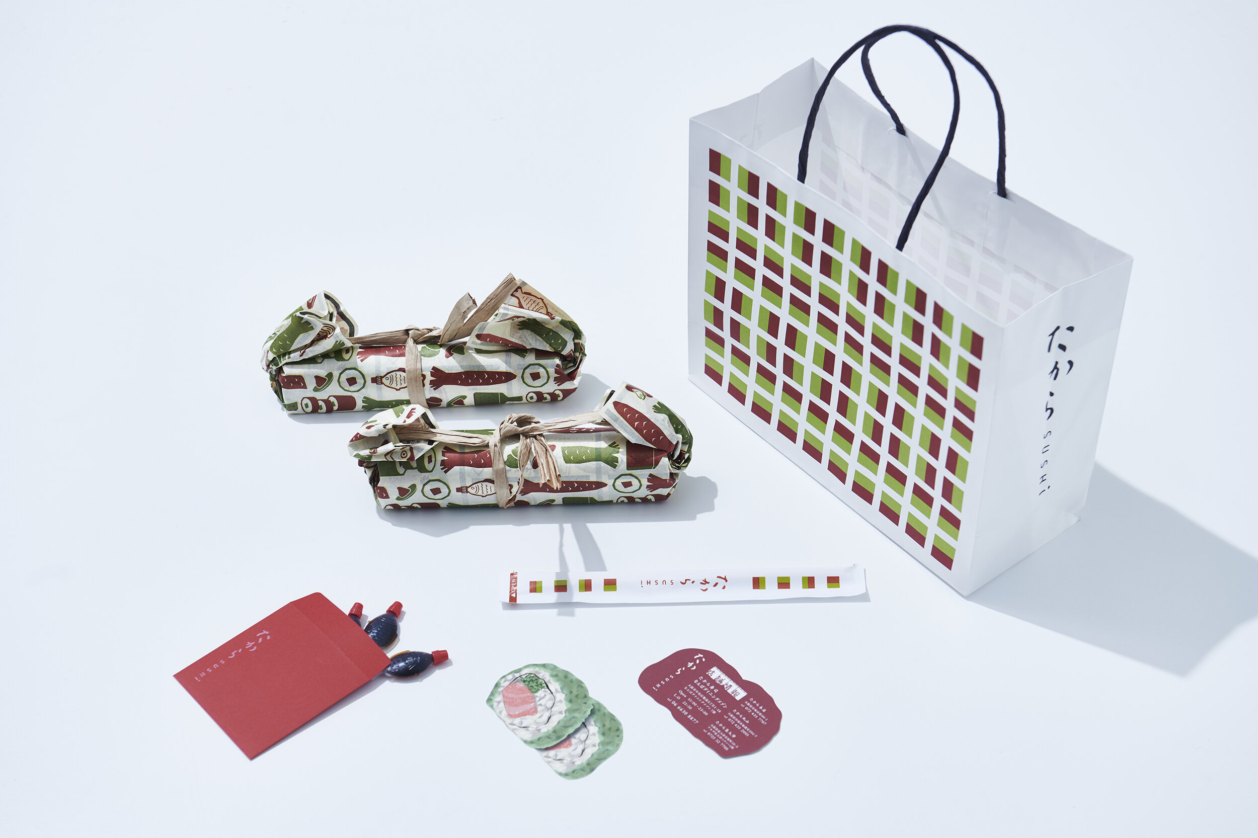
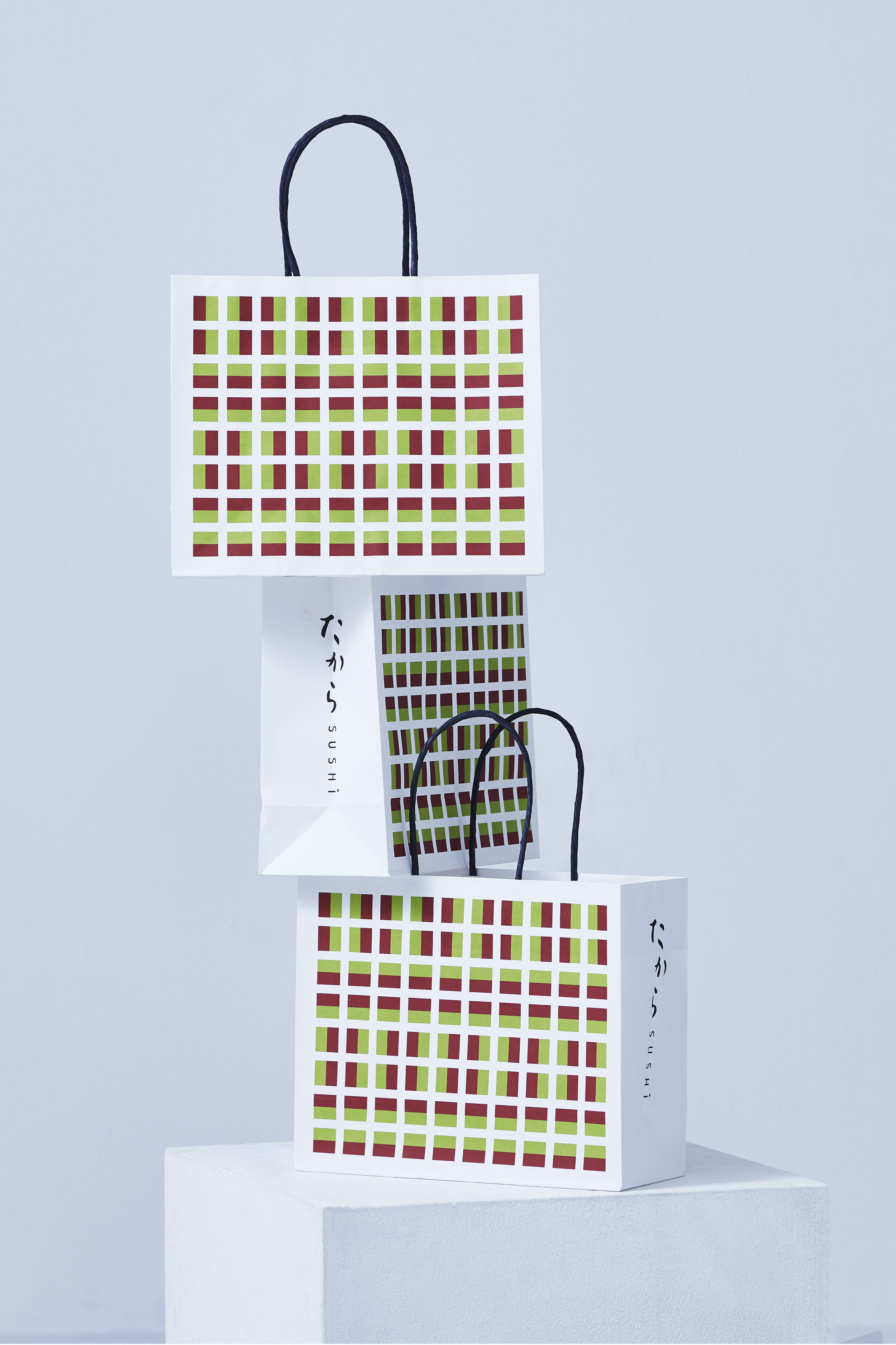
The bicolor of red and green, reminiscent of the famous Wasabi roll, was patterned and used as an icon to spread the brand's iconic image.
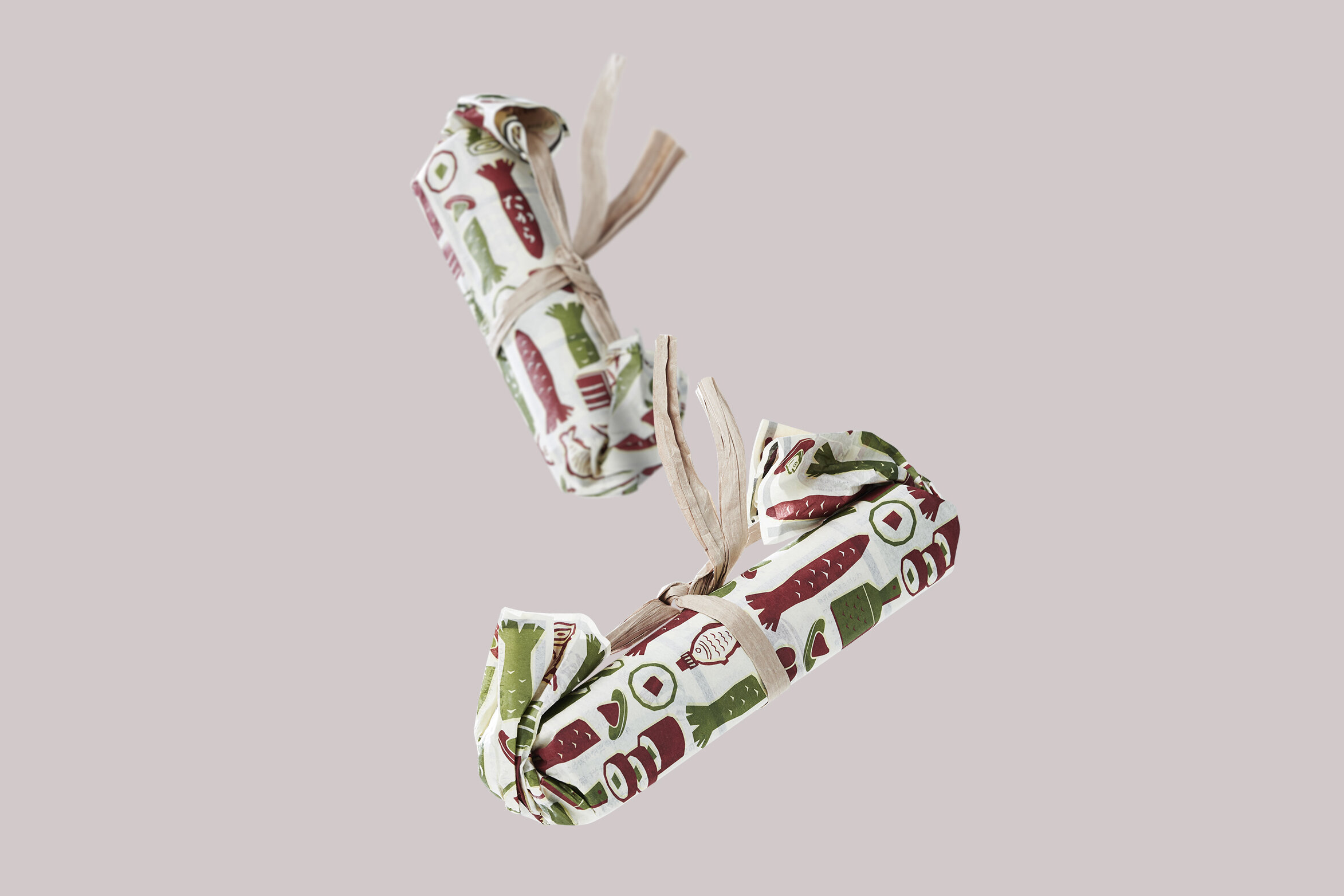
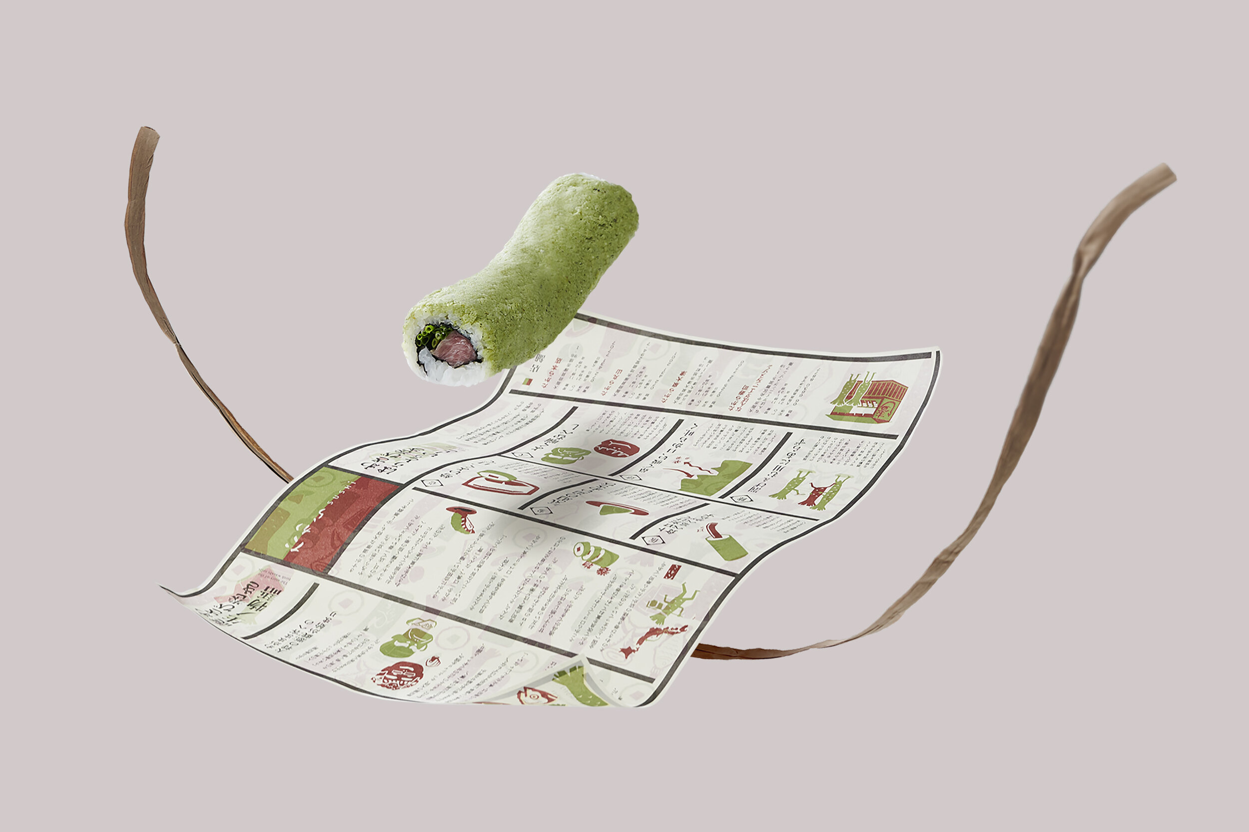
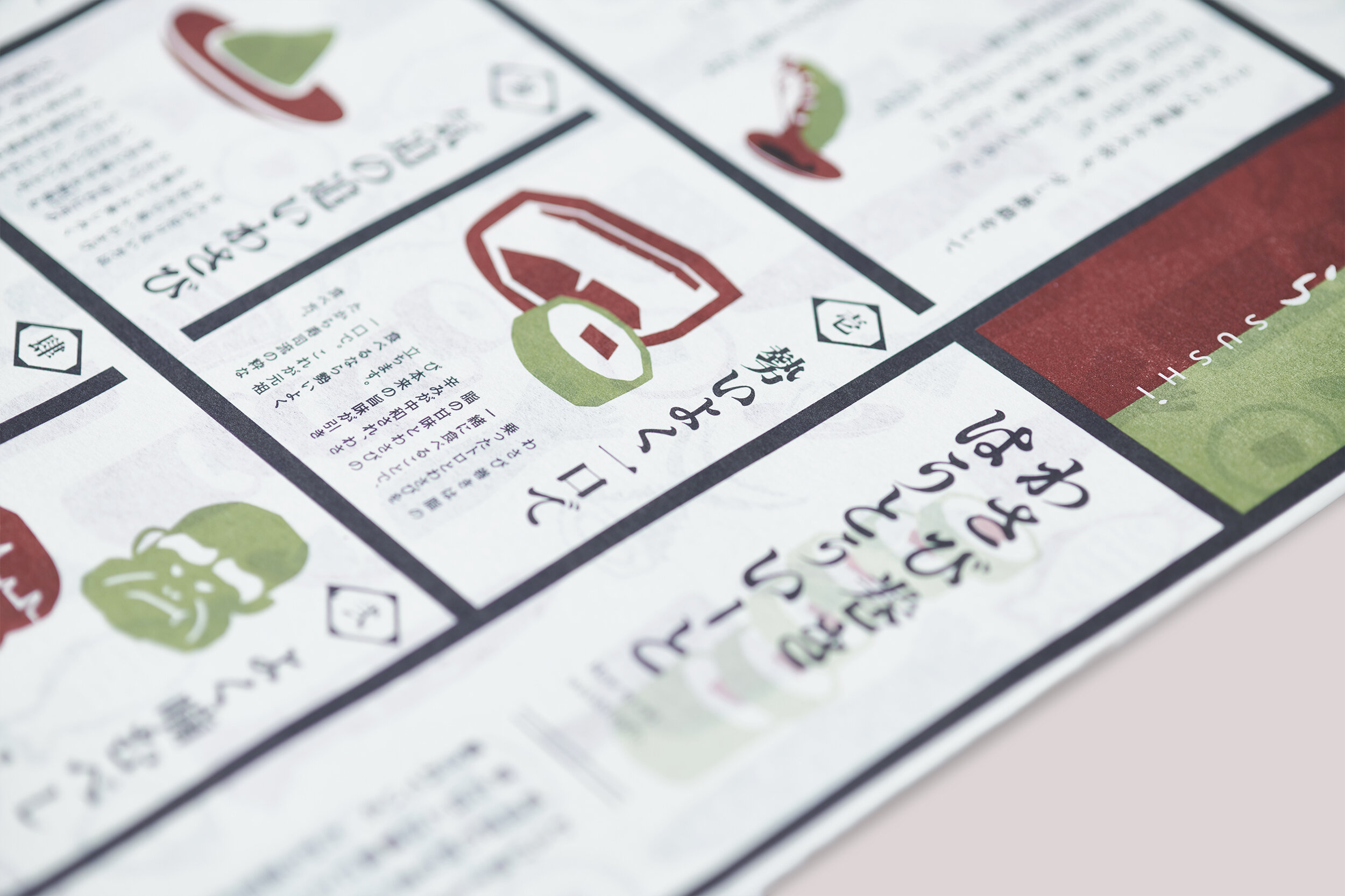
For the take-out package of Wasabi Maki, the signature product of the brand, we were conscious of the "maki" method and incorporated the motif of the shape that was symbolic as a souvenir in past eras into the modern form.
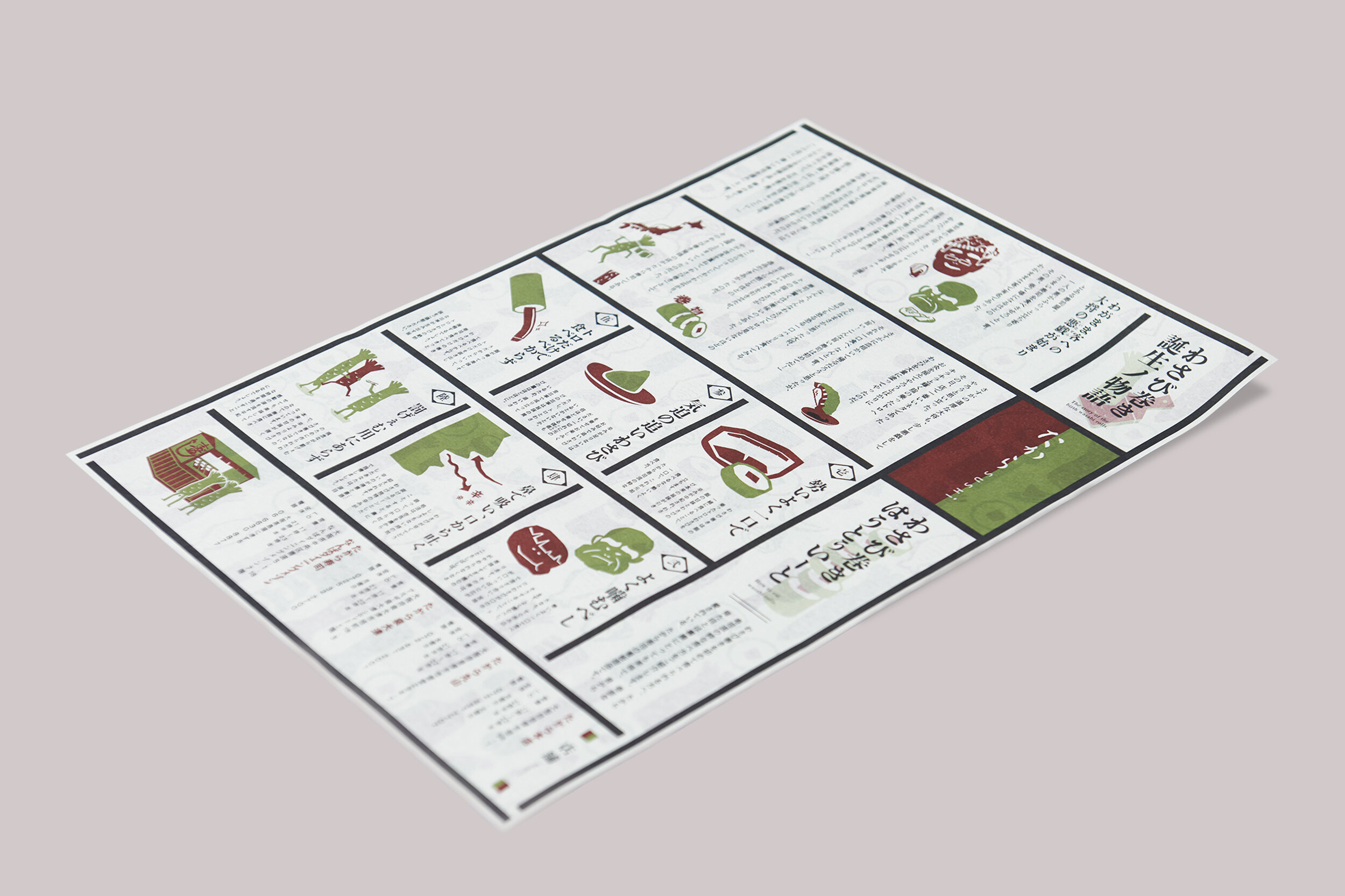
In addition, as a sustainable initiative based on the SDGs, excessive packaging was avoided and a single sheet of paper was used to consolidate the package and instructions, thereby reducing materials and costs.


