peligro


peligro
Client: Ginger & Company Inc.
Project Management/PR Direction:Kohei Okura(KIIIRO Inc.)
Creative Direction:Maico Nishikoji
Graphic Design:Mayuko Kanazawa
Artwork:Akari Uragami
Photography:Tomohiro Mazawa
Country: Japan
Based on the concept of "expressing nature's individuality," "peligro" is a slightly "dangerous" ginger syrup. The product's name (meaning "dangerous" in Spanish) was designed to intuitively convey the origin of the product, as well as the fact that the taste and appearance of the product will continue to change.
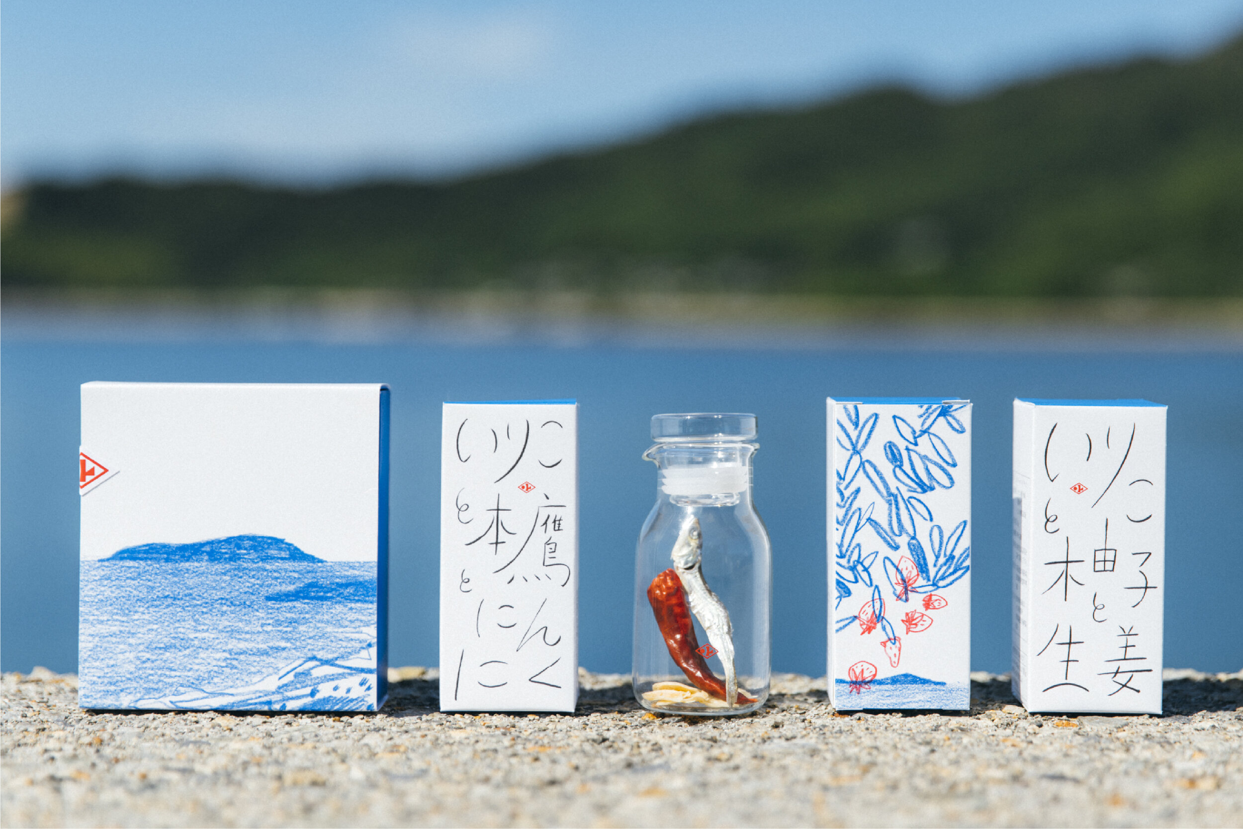
The label art of all four types expresses the delicate differences that are created with each production. The artwork was drawn by artist Akari Uragami. The logo was designed to incorporate the stimulating impression of ginger as well as the unbalanced nature of peligro, and the key color was set to yellow. The design is completed with a stimulating and unexpected image without losing the warmth and cuteness of the word ginger syrup.
By mixing the syrup, which changes its taste slightly depending on the time of year you pick it up, with a variety of unexpected things, a new brand was born with the hope that people will enjoy the "novelty with a bit of danger".


