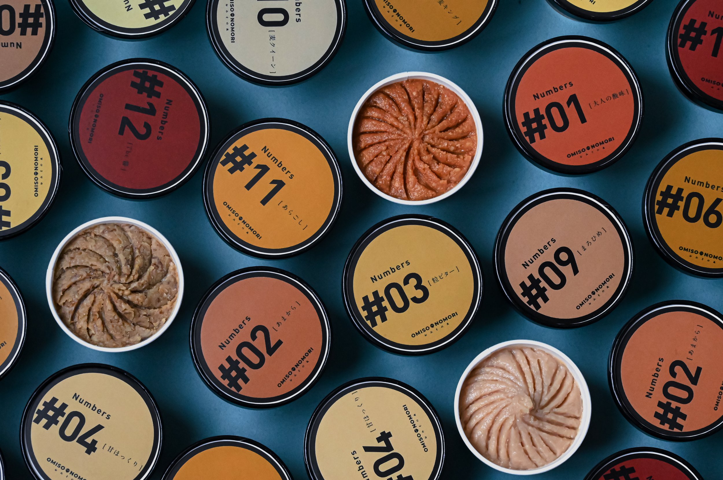
OMISONOMORI “NUMBERS”


OMISONOMORI “NUMBERS”
Client: MEDICEPT
Design Company: hanauta works
Creative DIrection: Yorito Yanagida
Art Direction: Shino MIsawa
Design: Shino MIsawa, Kosei Sugiyama
Country: Japan
This is a brand of additive-free miso that is not mass-produced and has been selected together with nutritionists. With the themes of “low-sodium,” “additive-free,” “colorless,” and “naturally derived,” the brand focuses on ingredients, focusing on rice koji and barley koji, and carefully selecting 11 varieties from miso breweries around Japan. The ingredients are all the same, such as soybeans, rice koji, barley koji, and salt, but the climate, weather, and koji ratio produce completely different tastes. We believe that once you taste the miso directly, you will be able to appreciate the differences between them. First, try a small scoop of miso.
The name of the item is a simple “number” to express our desire for you to taste the miso itself in its purest form. To convey the concept of miso from naturally brewed miso breweries around Japan in an easy-to-understand manner, the cup is made to look like a wooden barrel from a miso brewery, and the OMISO logo is prominently branded on the cup. The package was created by involving the producers and incorporating everyone's ideas into the design through a co-creation process. We used small paper ice cream cups to allow people to enjoy comparing the flavors and to enjoy it as a dip on the table.


