KOJI CLEAR


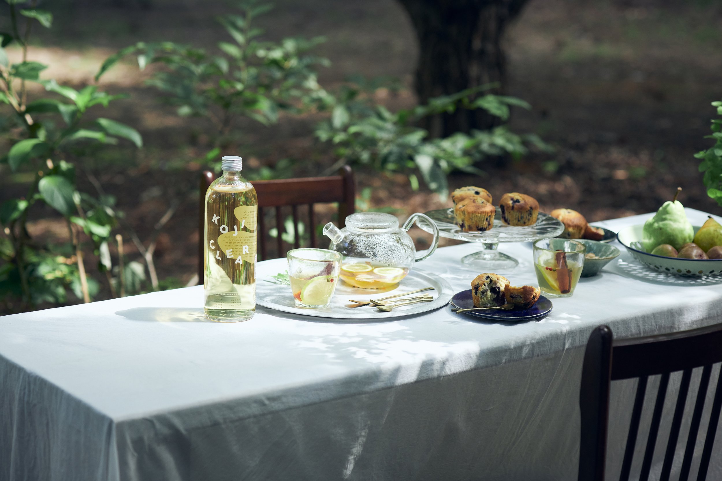




KOJI CLEAR
Client: Es Inc.
Art Direction: Naomi Okamura
Creative Direction: Kyoko Yonezawa
Country: Japan
While there is a huge increase in awareness of beauty, health, and the environment, with trends towards non-alcoholic, organic, vegan, and other conscious choices, KOJI CLEAR was born from the desire for a beverage that could be consumed daily with ease, providing energy with natural sweetness from trustworthy ingredients.
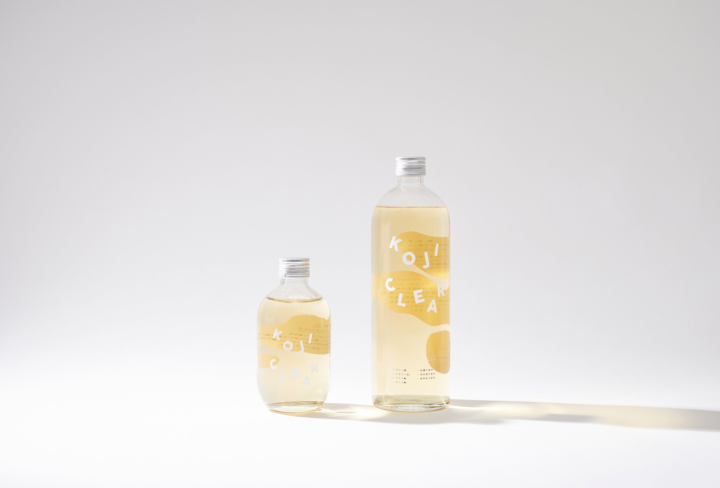
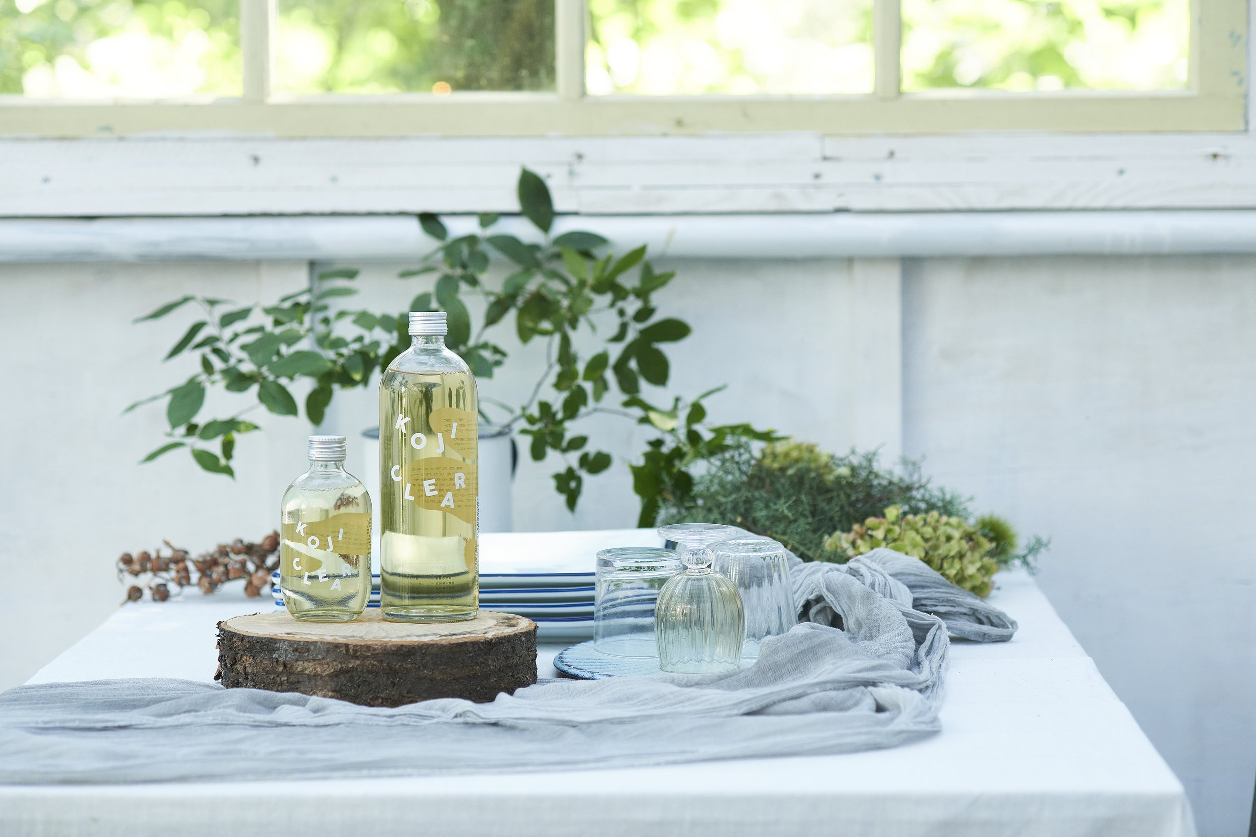
"New fermented beverage made from rice, KOJI CLEAR" stands out with its clear appearance and distinctive taste despite being a fermented drink. To express its "clearness" and the gentle, refreshing taste derived from rice, a rounded transparent bottle was chosen for packaging, with consideration for recyclability by using a glass bottle. The back label elements are printed on top of a rice mark in white ink. When viewed from the front, only the product name "KOJI CLEAR" and the white rice mark seen through the liquid are visible, enhancing the clearness of the product even when placed on a table, creating a beautiful presence.
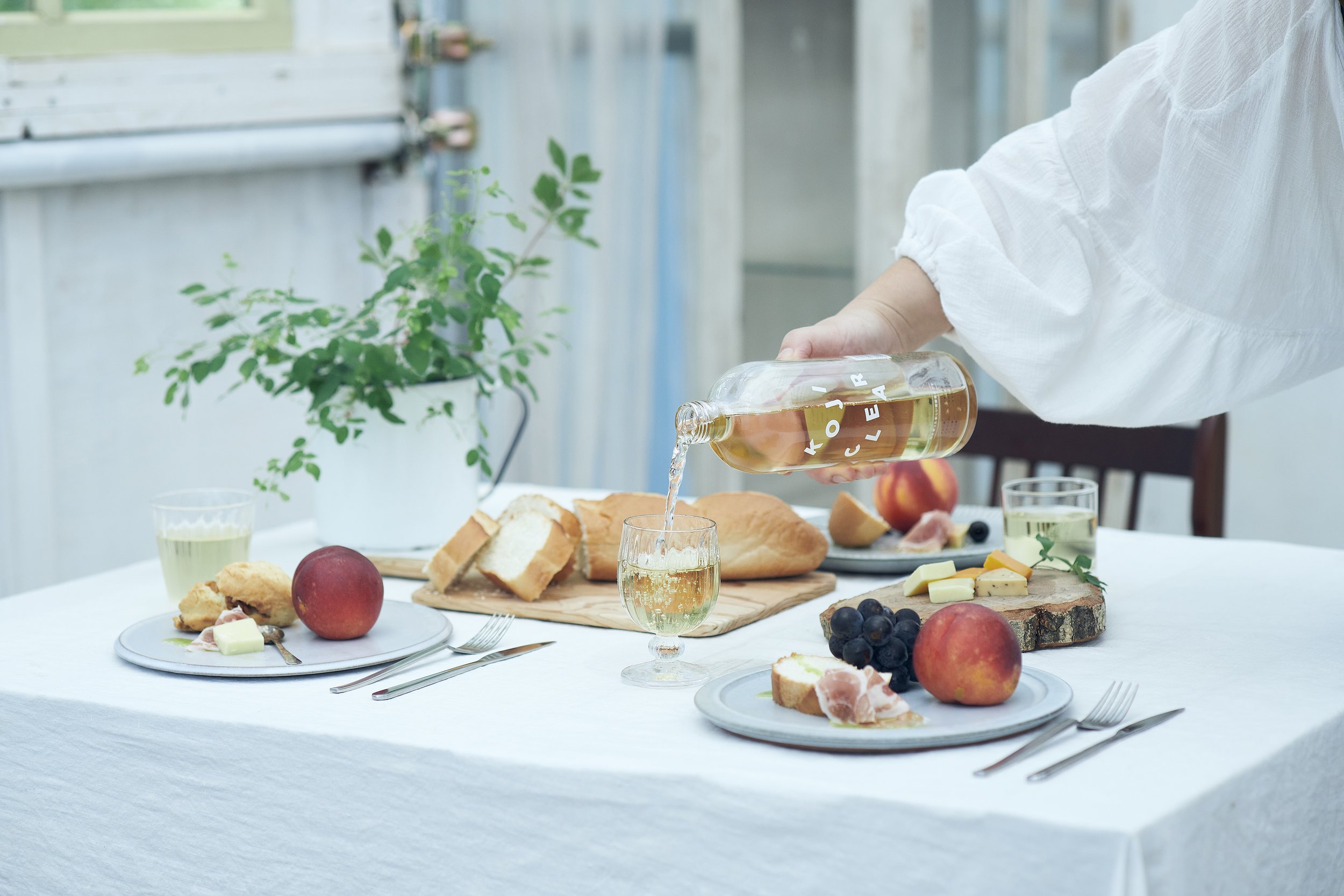
While functionally excellent as a beverage, the package design goes beyond functional appeal. It also considers how the product can harmonize with daily life, whether it's the freshness of morning light, the cheerful gatherings of the afternoon, or the silence of the night, aiming to enrich the quality of life and add color to everyday living.


