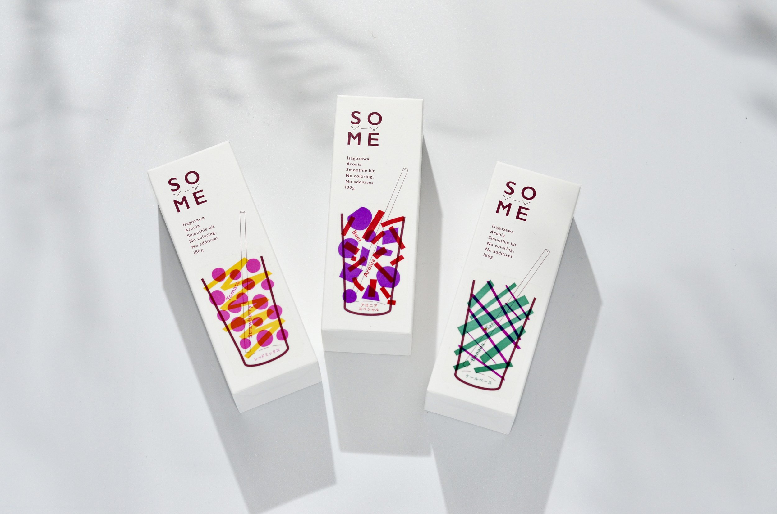
Deep Purple Carrot Smoothie

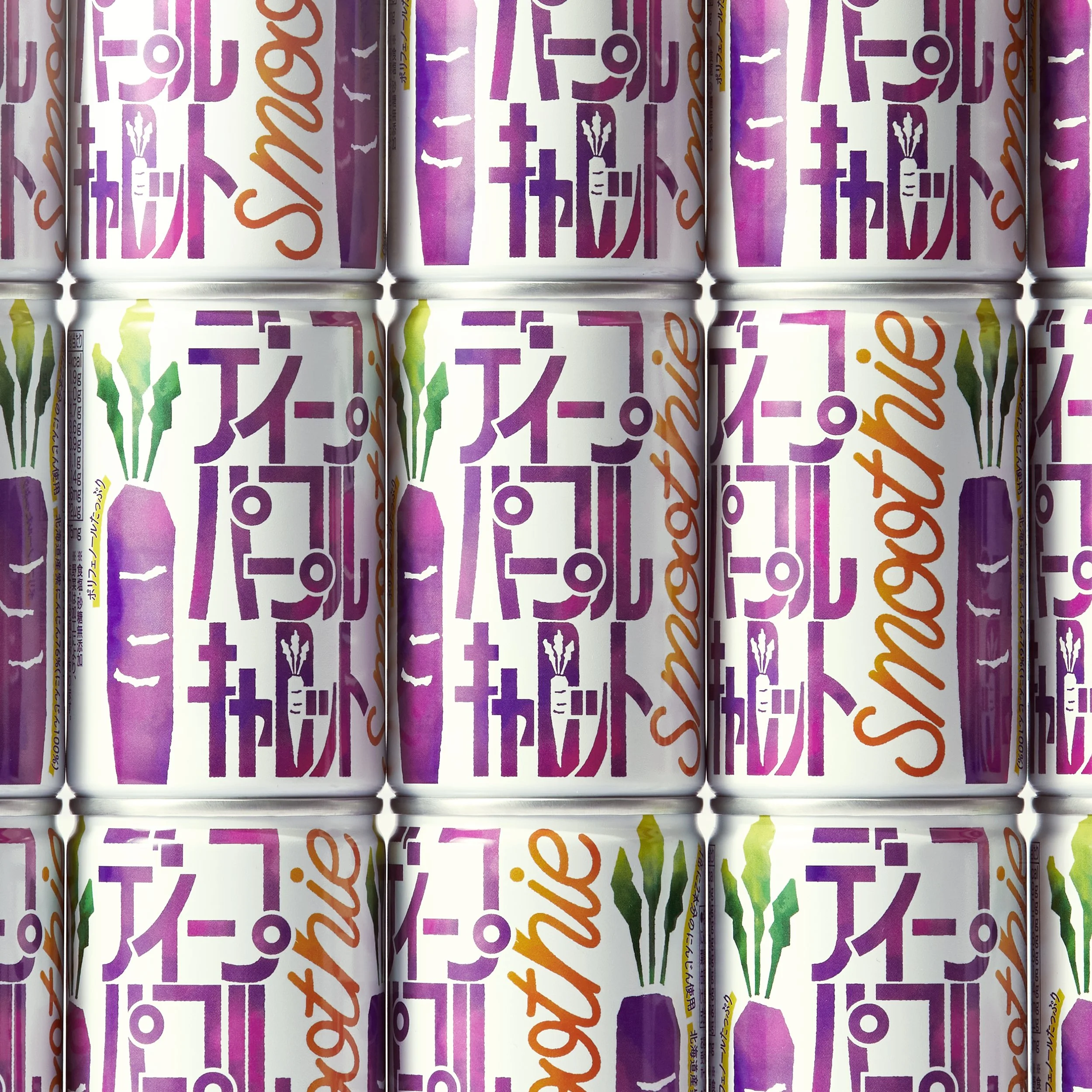


Deep Purple Carrot Smoothie
Client: GOLD PAK CO., LTD.
Design: L&C design INC.
Design: Hana Kato
Project Management: Mitsushi Hirano
Country: Japan
Deep Purple Carrot Smoothie is a smoothie-type carrot juice using two Japanese purple carrots (variety: Deep Purple)in one can. It is targeted at working women in their 30s - 40s. The product uses purple carrots, which have higher nutritional value than regular carrot juice, and a design concept was needed that would convey the functionality of the product, but also have a natural feel of vegetable juice.
The design concept is “active vegetable juice". The main logo type is based on the English typeface DIN, which is characterized by horizontal and vertical lines, and katakana characters with a functional shape. Although the functionality of the logo could be conveyed in the English logo, the katakana characters were chosen to convey both “domestic” and “functionality” in a Japanese linguistic sense, and to resonate with the target audience. The color scheme used an energetic vivid color on a white background to convey the freshness of the vegetables, with watercolor textures added to convey the naturalness of the vegetables. Since this is only sold online, we also focused on the carton, which is the touch point for the consumer. When they open the door to receive the product, the design intuitively conveys the fact that this single box of purple carrots is packed with nutrients and inspires them to live a healthy life.