Oddly Juice

Oddly Juice
Client: Oddly
Design Company: Stamp Works
Design: Jin Fujiwara
Country: Japan
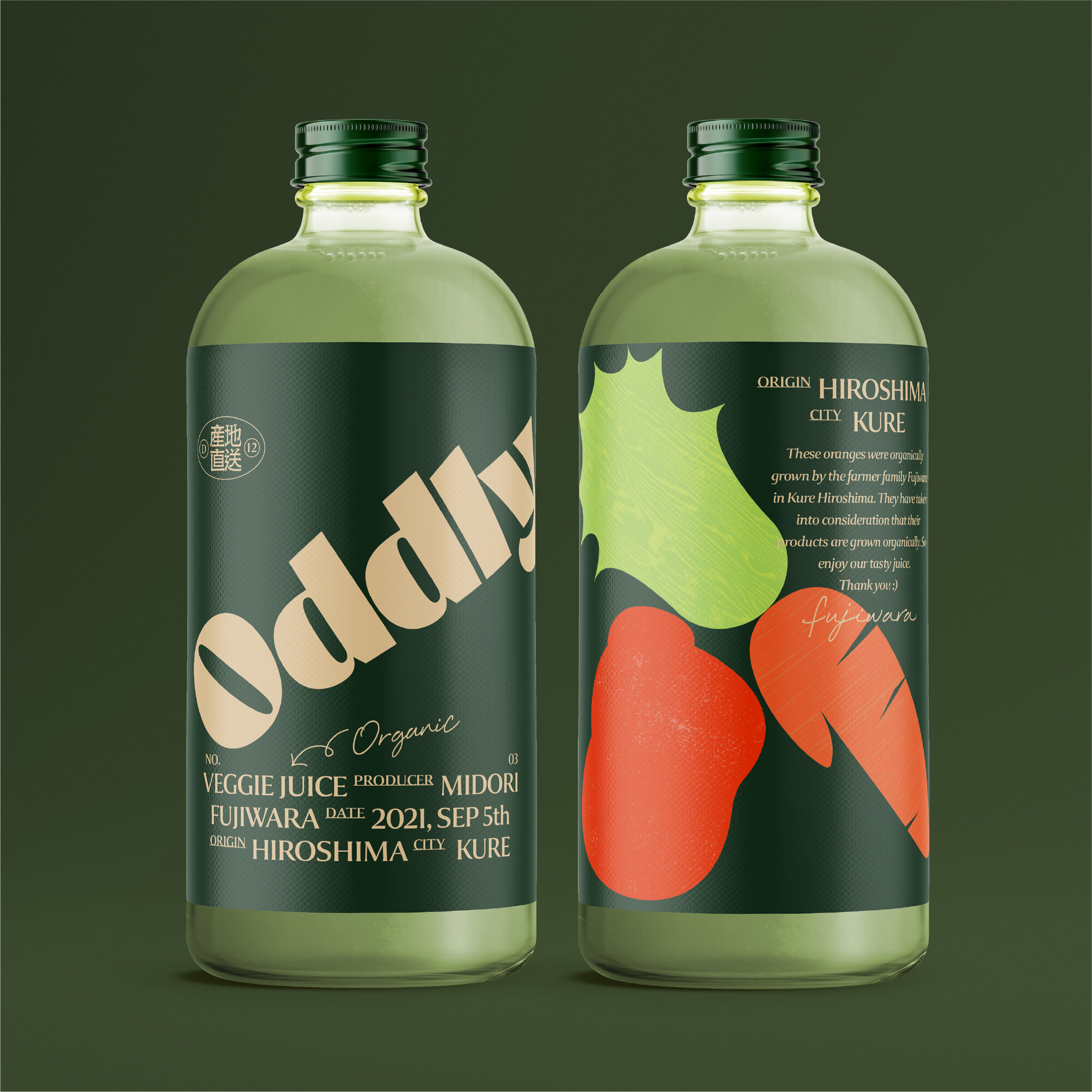
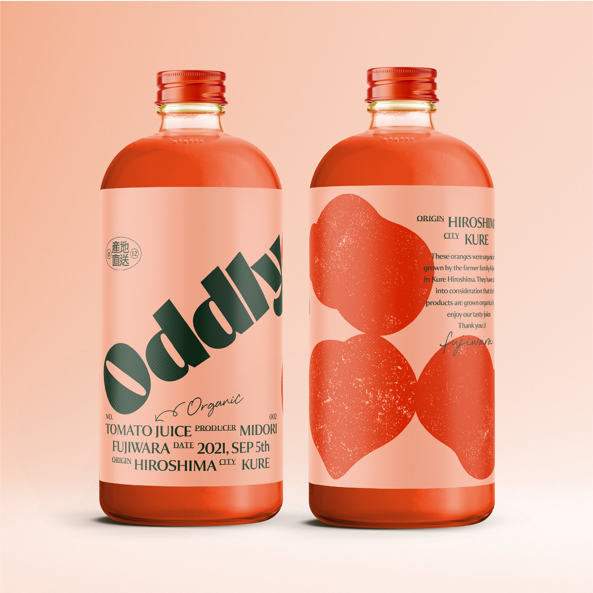
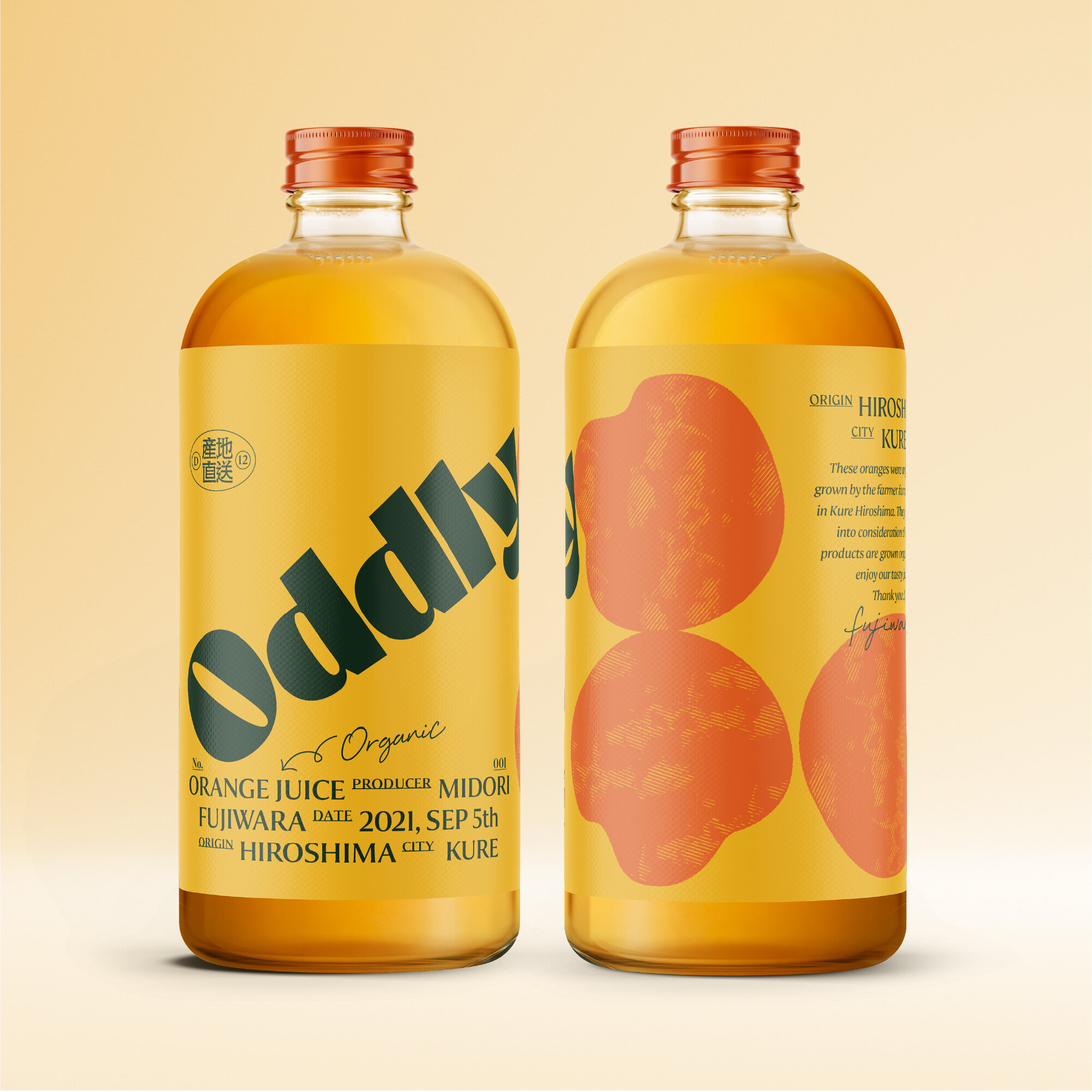
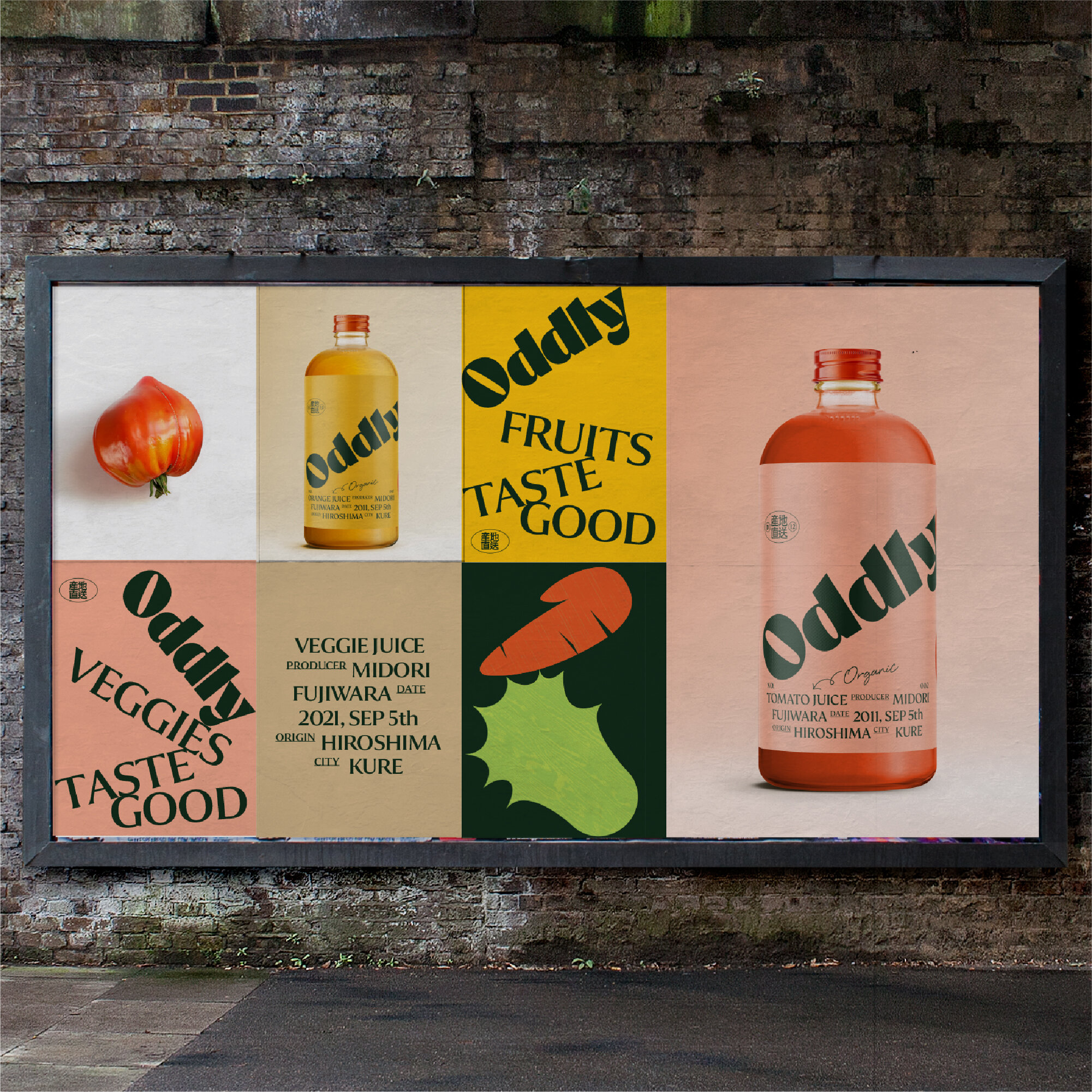
The owner of Oddly uses veggie that are too ugly for their products. We wanted to use the "ugly shape" of the vegetables since it conveys organic, less mechanical feelings. We didn't want to use a photo for illustration because it didn't have the right taste appeal for us. We would rather illustrate the veggies and fruits by their shape and silhouette. It's much more interesting than photos.
Additionally, we added character to the illustrations, and if you look closely, some of the veggies have a wooden texture. It’s a small detail that we added to make the illustrations a little more close to nature. Also using the typography that are imperfectly stacked, just like the vegetables and fruits that are in the delivery box.


