CLAYD WeekBook

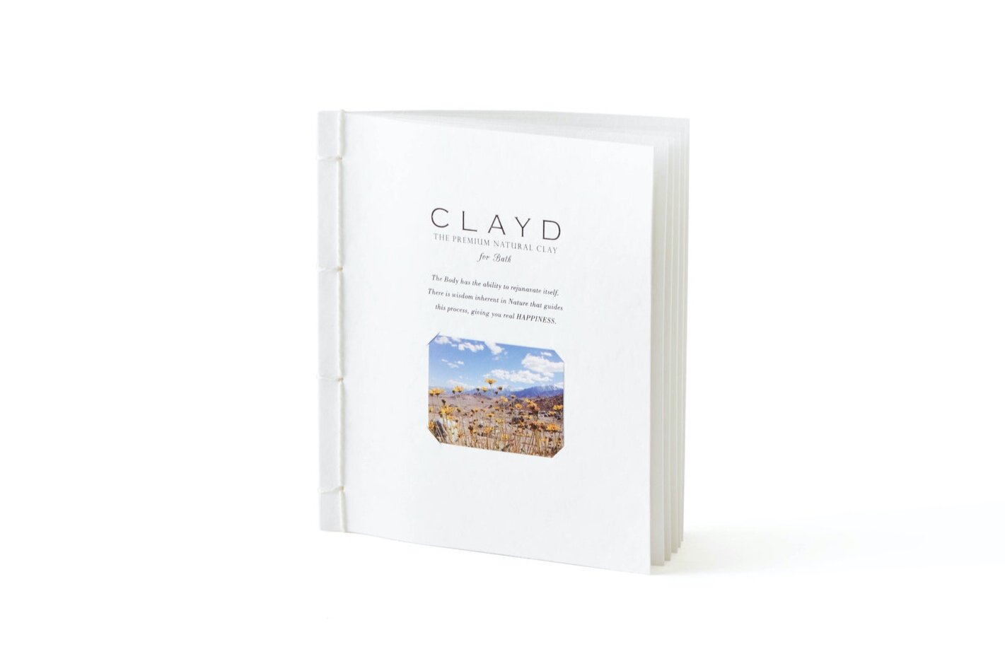
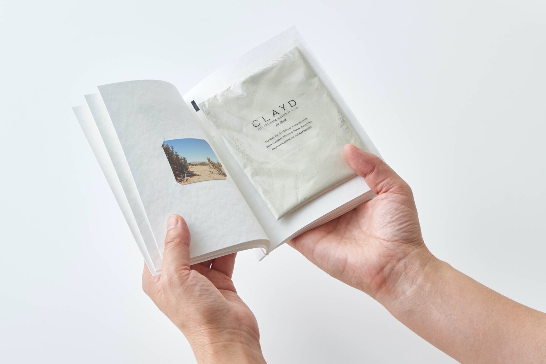
CLAYD WeekBook
Client: Mother Earth Solutions Co ltd
Design Company: PLANTIS Inc.
Design: Keijiro Yamaguchi
Country: Japan
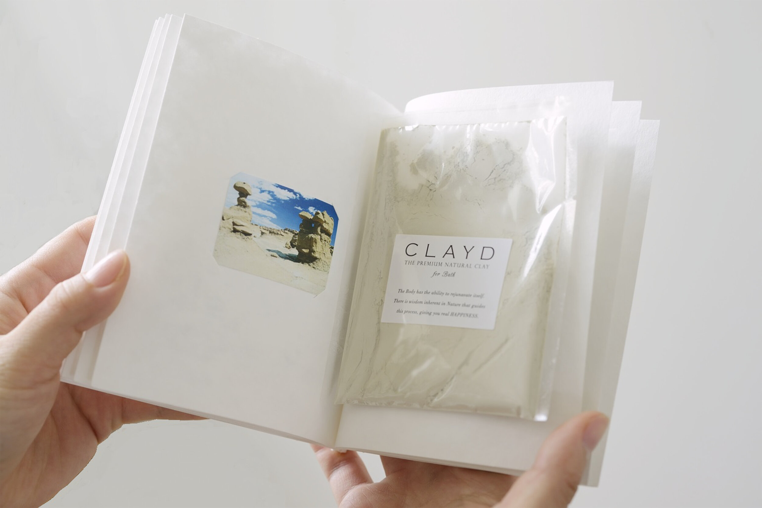
To deliver the power of healing through detox and nature; clay, sourced from the deserts of the West Coast in the United States, a natural ingredient that has been used by Native Americans for a long time, is developed into a bath product.
The role of packaging design conveys the product without exaggerating its appeal. This special clay was born in the United States, but also born in Japan as a sought after product. Using photographs of the area where the clay was collected, we made it into a book-like packaging using Japanese book-binding techniques.
This form of a book delivers the brand’s message: importance of having a relationship with nature. It also makes you feel that you have the “story” at hand. Different variations of photos were used on the cover and inside and the Japanese book-binding were done by hand. As a result, even though they were mass-produced, each product is individually unique. This is the characteristic of CLAYD. It also conveys the message that everything born in nature is not uniform.