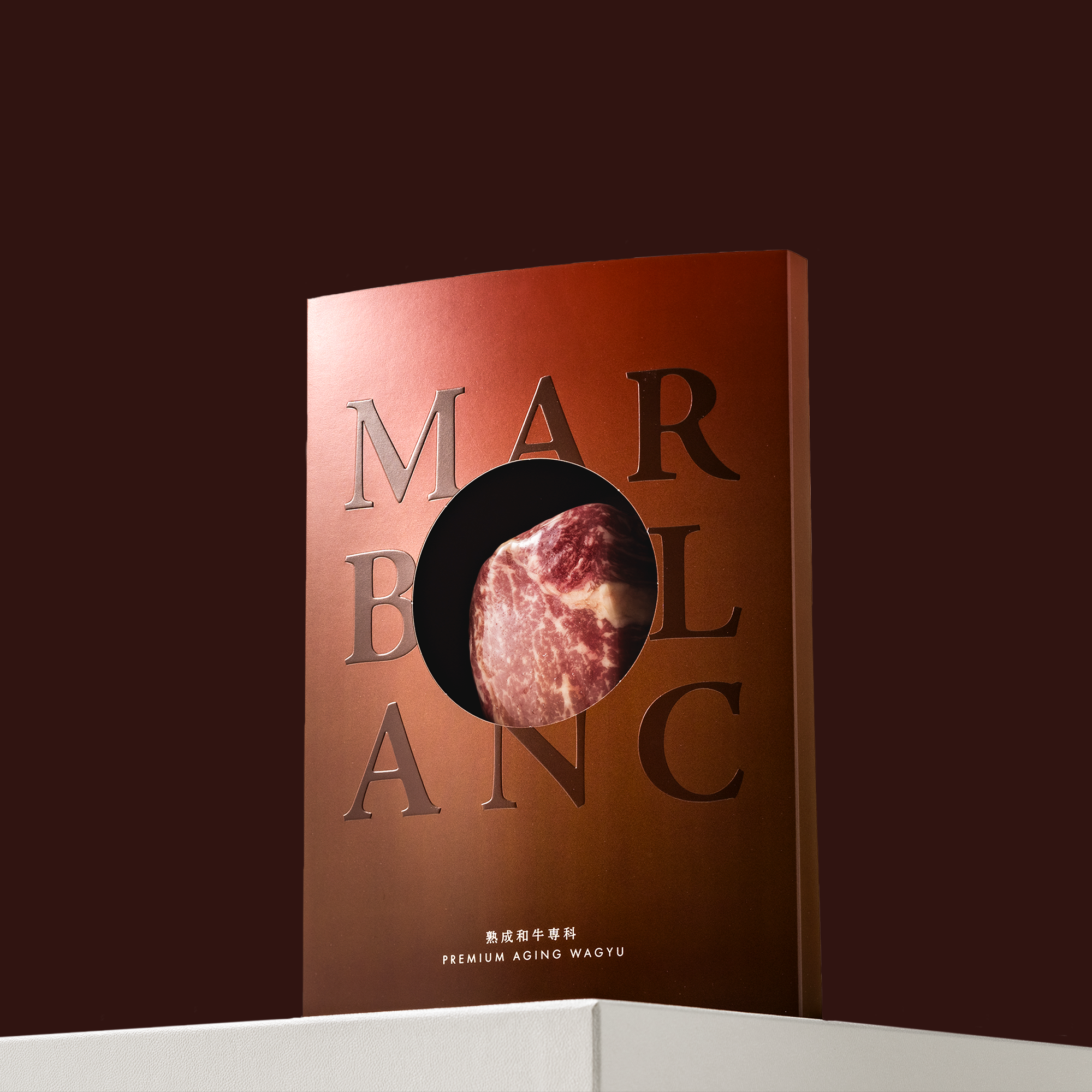
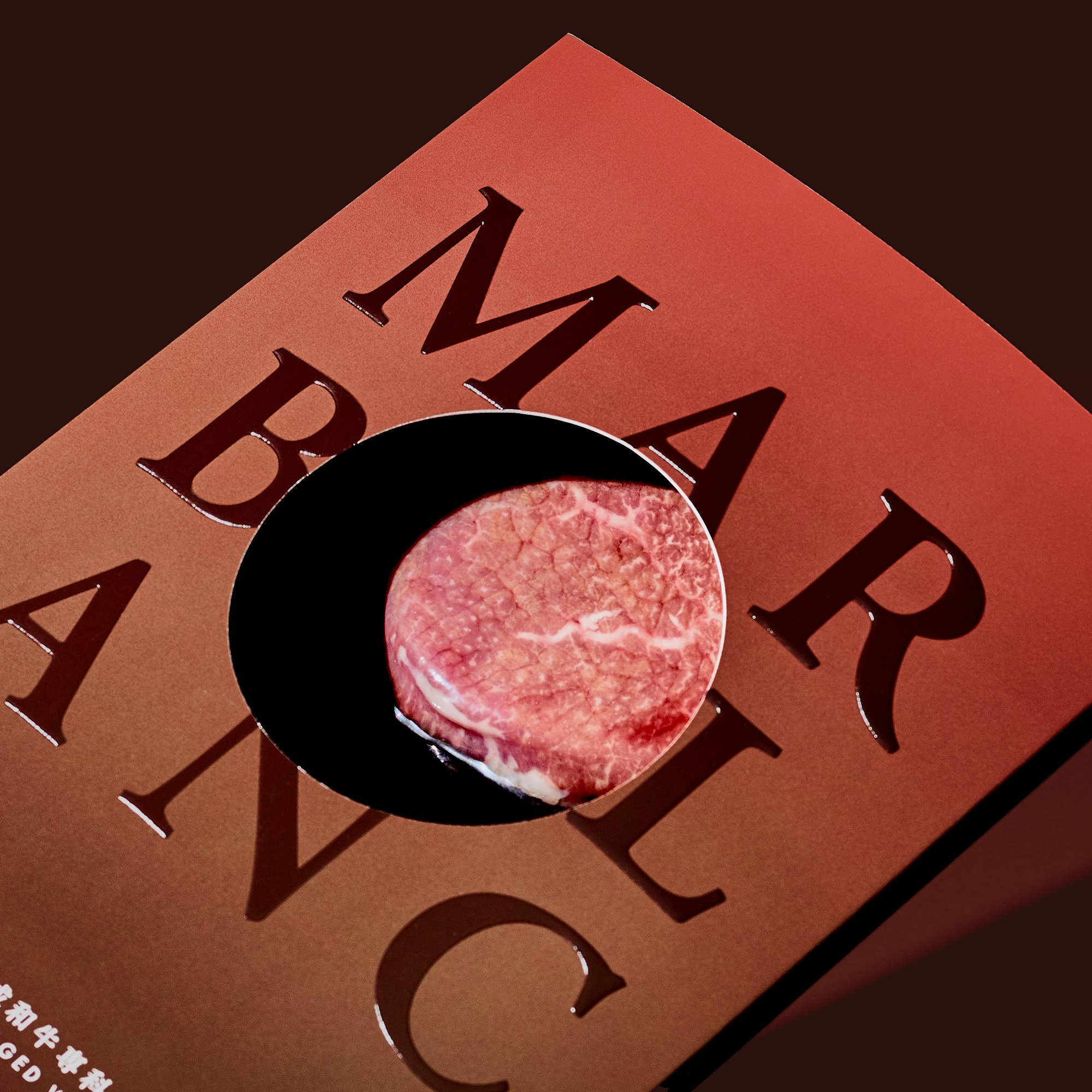
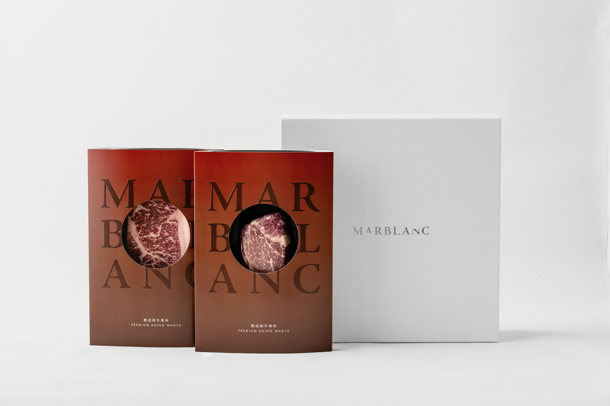
MARBLANC

MARBLANC
Client: MARBLANC Inc.
Design Company: MARBLANC Creative Team
Creative Direction/Design: Sana Sato
Country: Japan

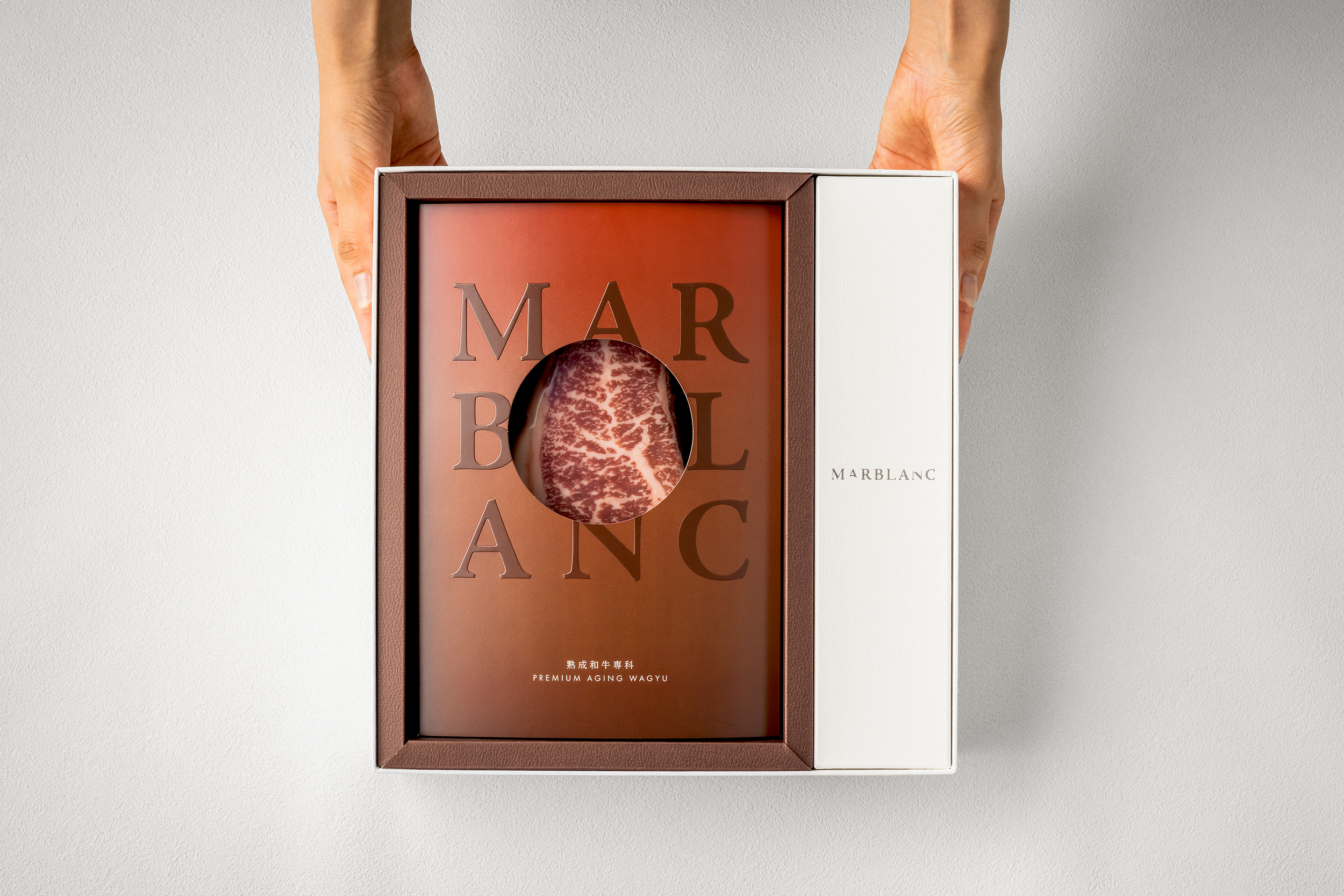
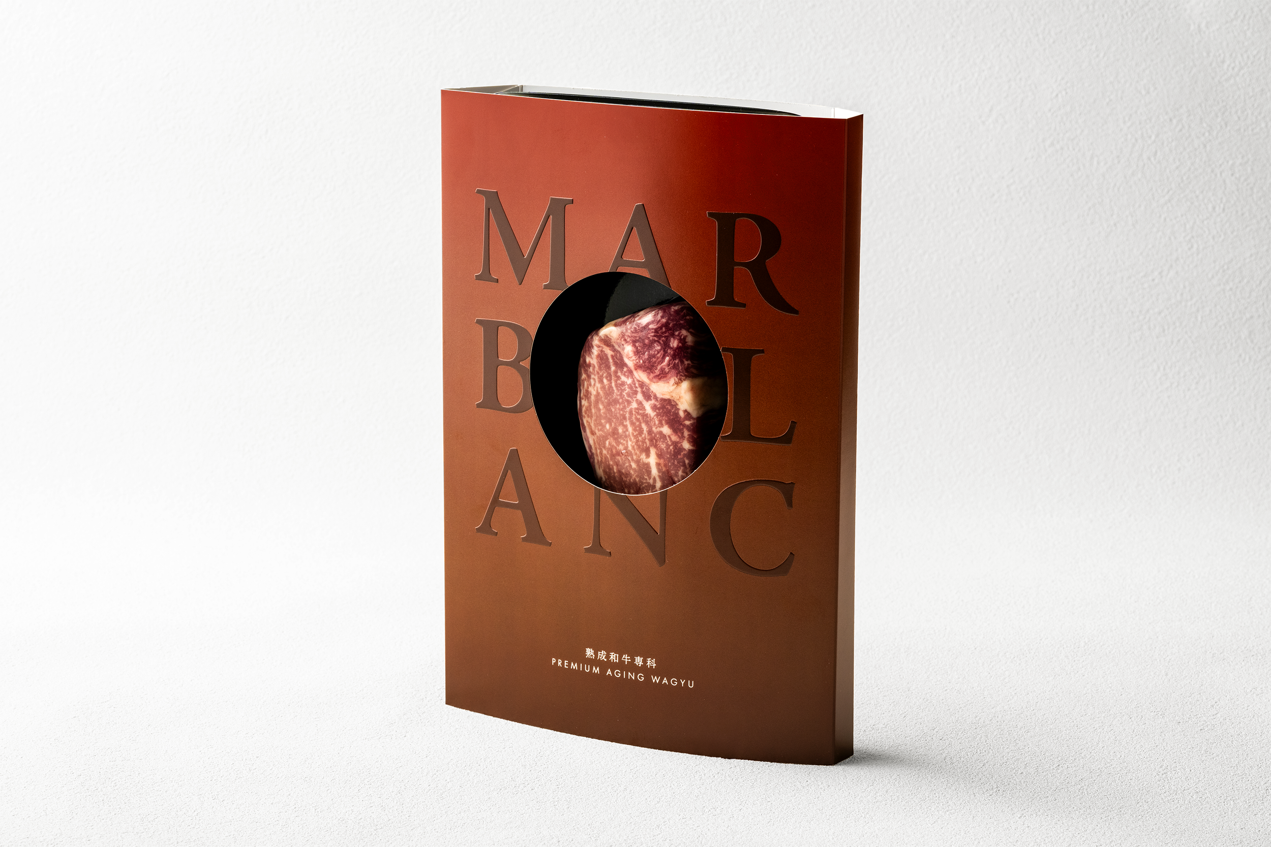
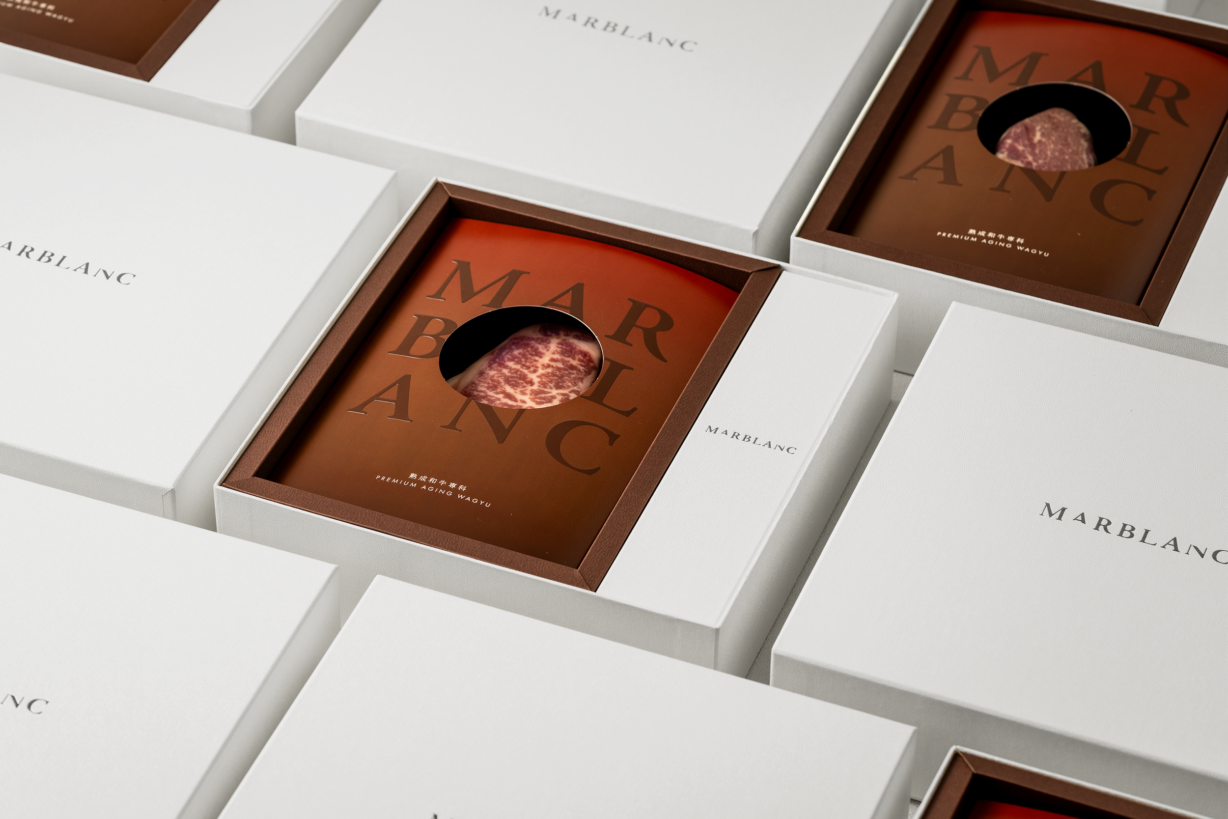
MARBLANC is a coined word that combines the words "marbling," meaning marbling (fat), and "blank," meaning blank. The package design, in which the center of the logo is rounded out and the meat inside can be seen through the hollowed-out space, incorporates the philosophy of "bringing new value of Wagyu beef to the blank space."
The design also expresses the brand's attitude of looking into the future of the industry without losing sight of the essence of providing the value sought by consumers, which is considered to be the center or "core" of the meat.
The color gradation represents the depth (flavor) of the product, aged Wagyu beef, as it matures in a unique aging process, and the materials used are glossy to create a sizzling effect from the package.