
TSUYAHIME
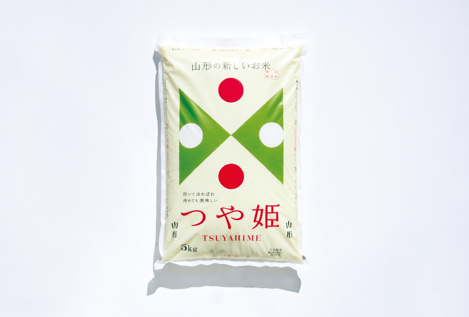

TSUYAHIME
Client: Yamagata Prefecture
Design Company: MR_DESIGN
Art Director: Kenjiro Sano
Designer: Masashi Murakami
Country: Japan
Find out more on: http://www.tuyahime.jp/ or https://mr-design.jp/
"With a very simple logo mark, I thought it would good if it held a clear symbolic nature, and made to be easily understood no matter what size it was used in. A sense of symmetry and colour function as the mark, and works well in smaller sizes as well. The rice was of high quality in the first place, so I believed a brand logo high in functionality will raise awareness of the product. As a whole, I aimed for a design that makes one feel a noble and gentle atmosphere; one that will be suitable for the product name 姫 ("hime", meaning princess in Japanese), completing a mark and package that looks like a rice ball, a hinomaru bento (a pickled plum in the centre of white rice, reminiscent of a Japanese flag), and even a princess extending out her hands."
Digital Communication services, including website design, search engine optimization, social media, and content creation for nonprofit organizations, consultants, and creative entrepreneurs.


