THE MILK 500ml


THE MILK 500ml
Client: THE MILK SHOP (TANAHASHI FARM)
Design Company: Design delivery ROUTE INF.
Design: Hideaki Ban
Country: Japan
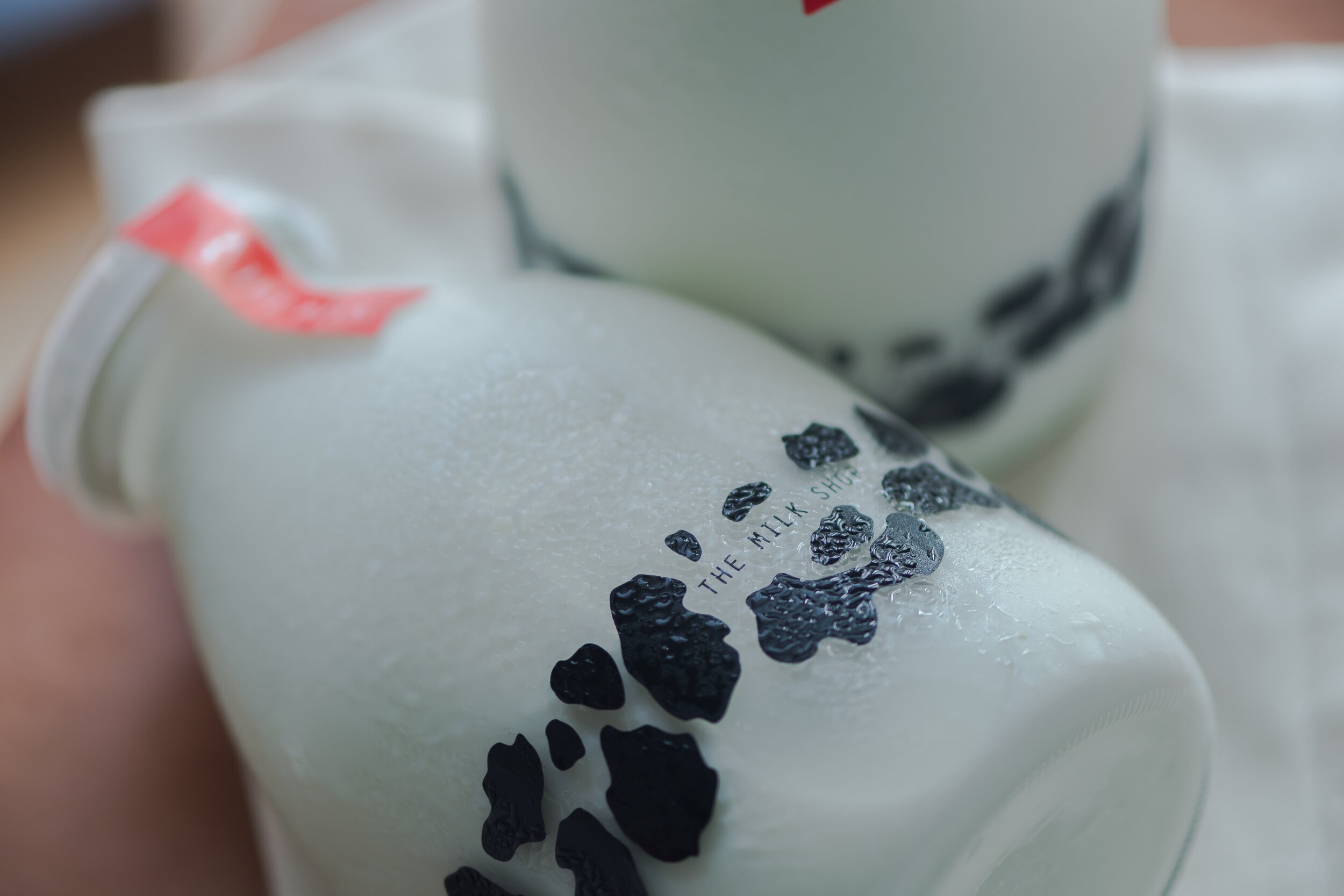
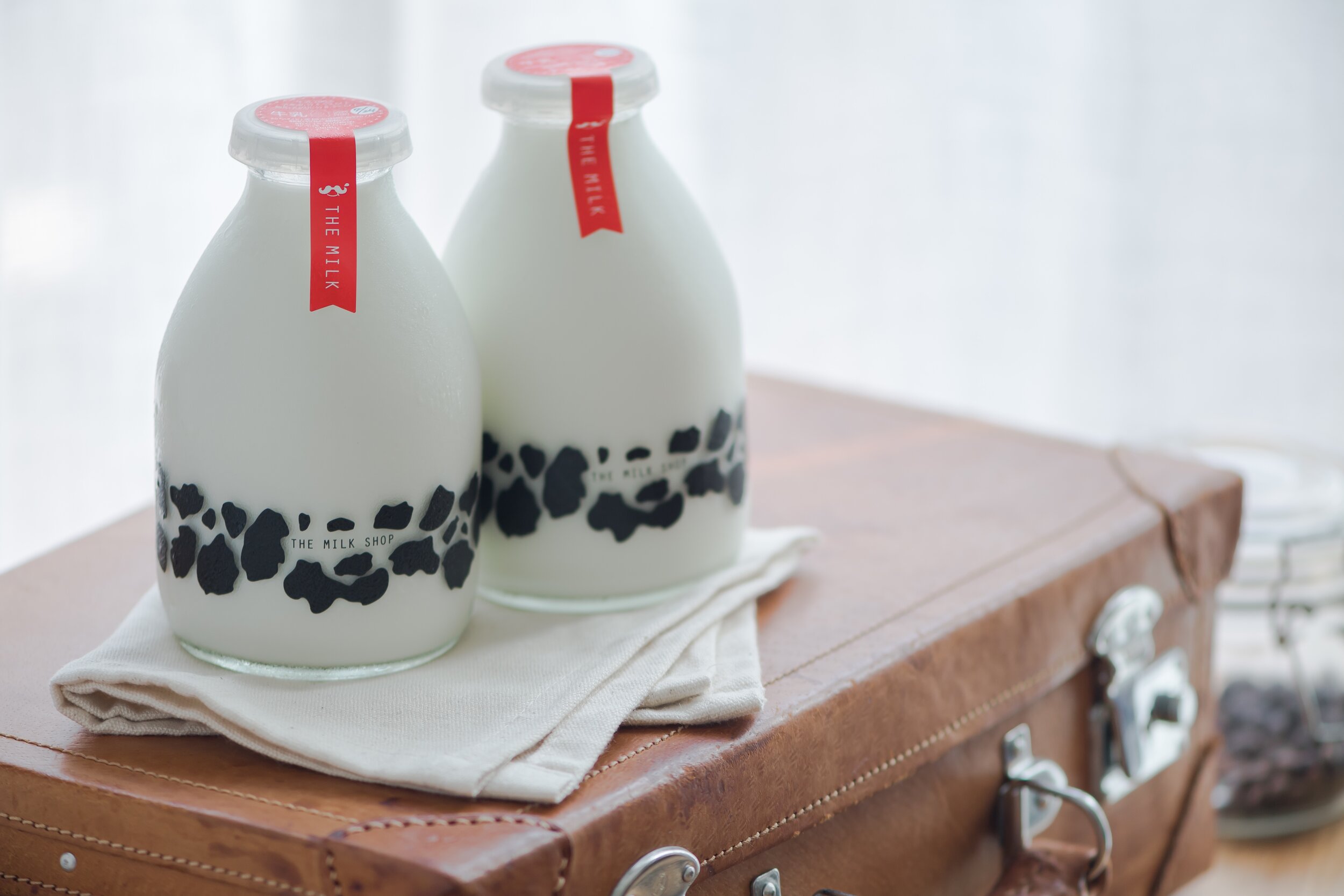
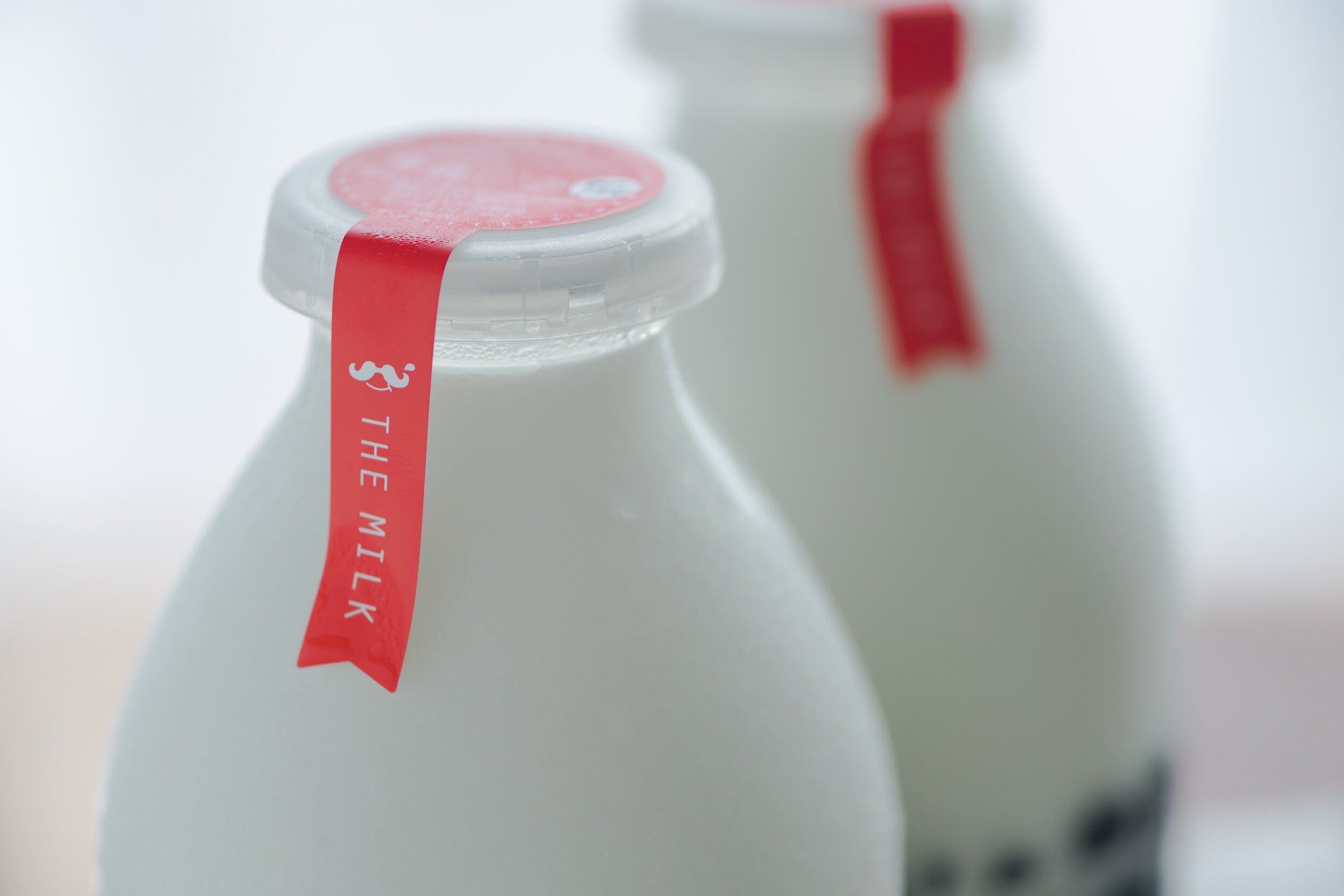
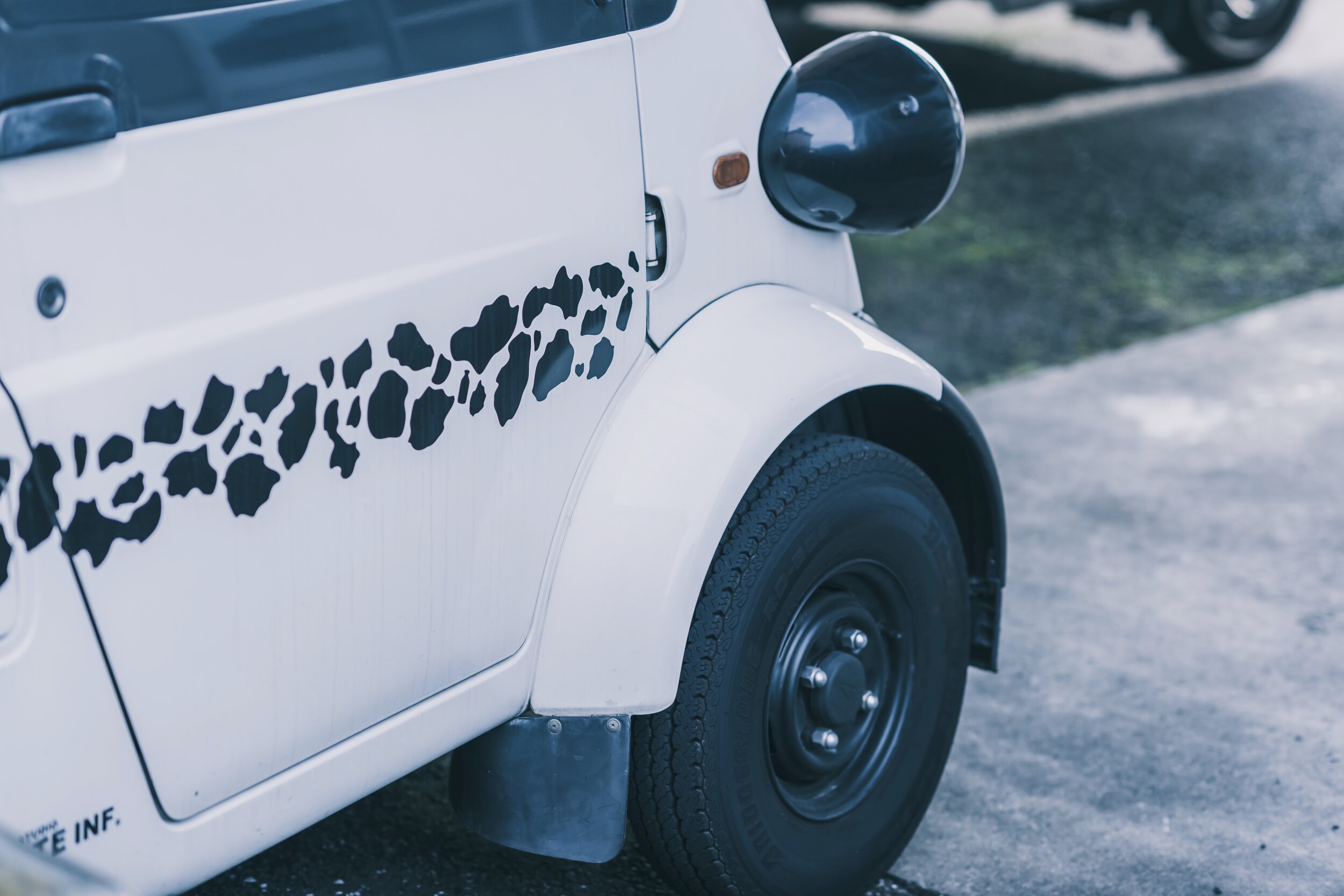
The client’s idea is simple and very close to the real thing. The straightforward design of making jars appear like cows aligns with the brand’s concept of “Enjoy Milk!” - it is catchy and easily understood by everyone, including children. As I want to add an accent, I apply a red ribbon on the lid to indicate the product name and the necessary information. I use “ribbon” as I had an image of this product as a gift from nature. This design is the foundation for the brand’s image, promotional materials, and even the retail car design.
This design is not only easy to understand. In Japan, used milk bottles are generally returned to the manufacturer for recycling, but our milk bottles are different. Customers may keep the used bottles and reuse them for something else. This makes it easier and more accessible for younger buyers who don’t usually buy milk. When you drink our milk, you can taste the deliciousness; how it has been made by our traditional manufacturing process of over 100 years.
Digital Communication services, including website design, search engine optimization, social media, and content creation for nonprofit organizations, consultants, and creative entrepreneurs.


