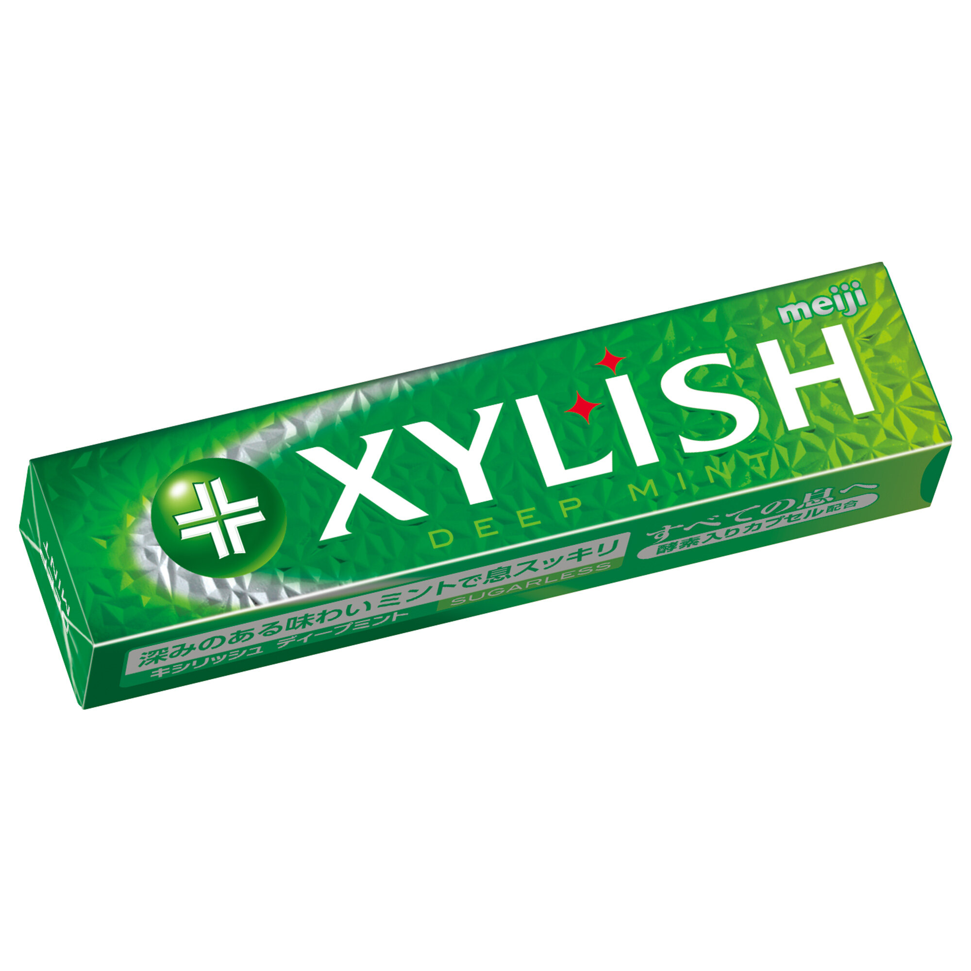
XYLISH


XYLISH
Client: Meiji Co., Ltd.
Design Company: Kawai Design, inc
Art Director: Tetsuya Kawai
Designer: Taku Okuda
Country: Japan
"In 1997, Meiji XYLISH Gum emerged on the market with a name that expresses the product feature: "refresh with xylitol". Since its launch, the packaging pursued an image that is "clean" and "orthodox" with white as its base colour. Now, to accentuate the white, we combined the inner box in metallic silver, with a white outer rapper. Along with this, the current package creates a transparency between the flavour colour and the white on the wrapper, further enhancing the refreshing feature of the product. As for its packaged form, while paper wrappers were the norm at the time, XYLISH adopted a sliding box to increase portability and to make it easier to take the pieces of gum out. Furthermore, the package can conveniently fold up when there is little gum left in the package."
Digital Communication services, including website design, search engine optimization, social media, and content creation for nonprofit organizations, consultants, and creative entrepreneurs.


