uka beige study two
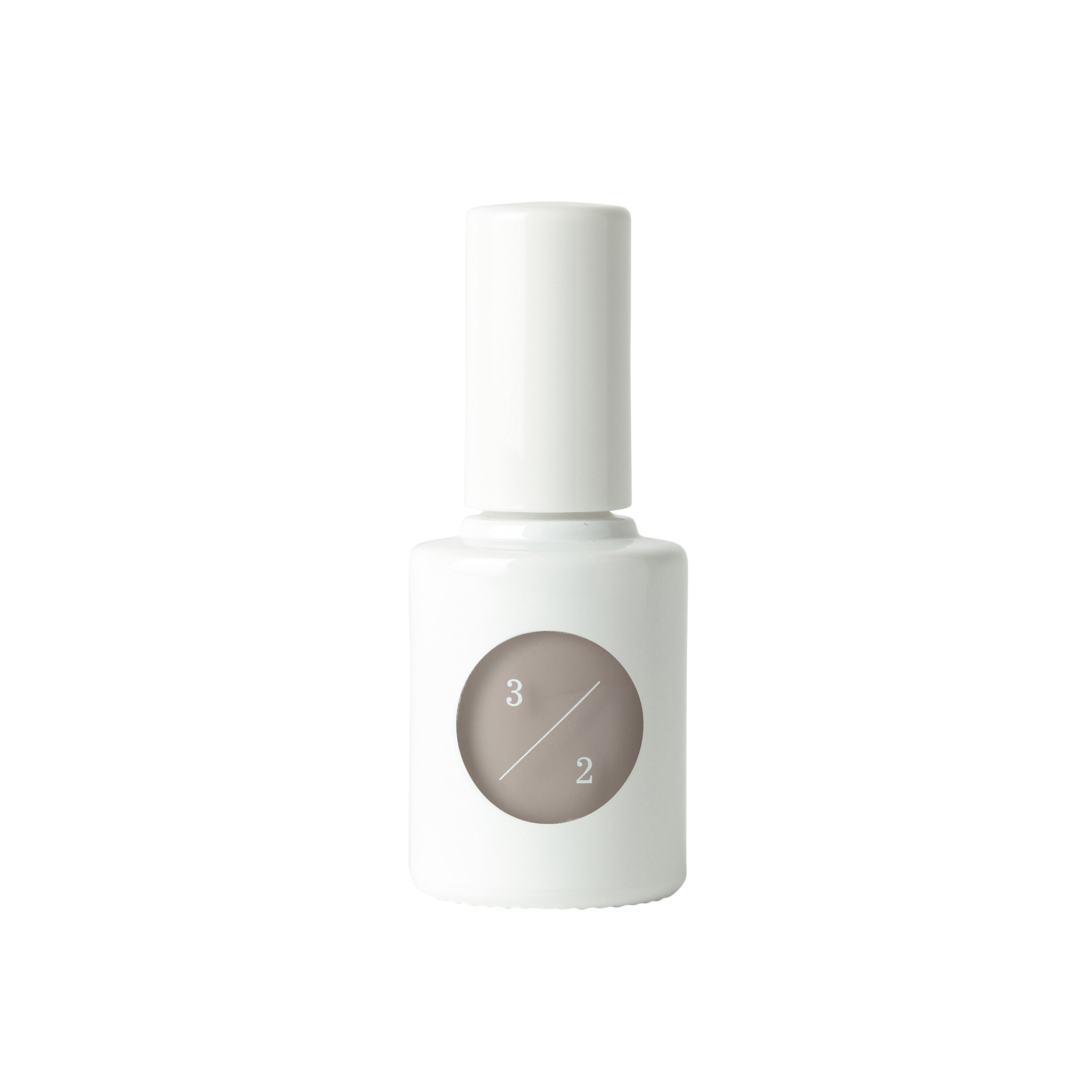
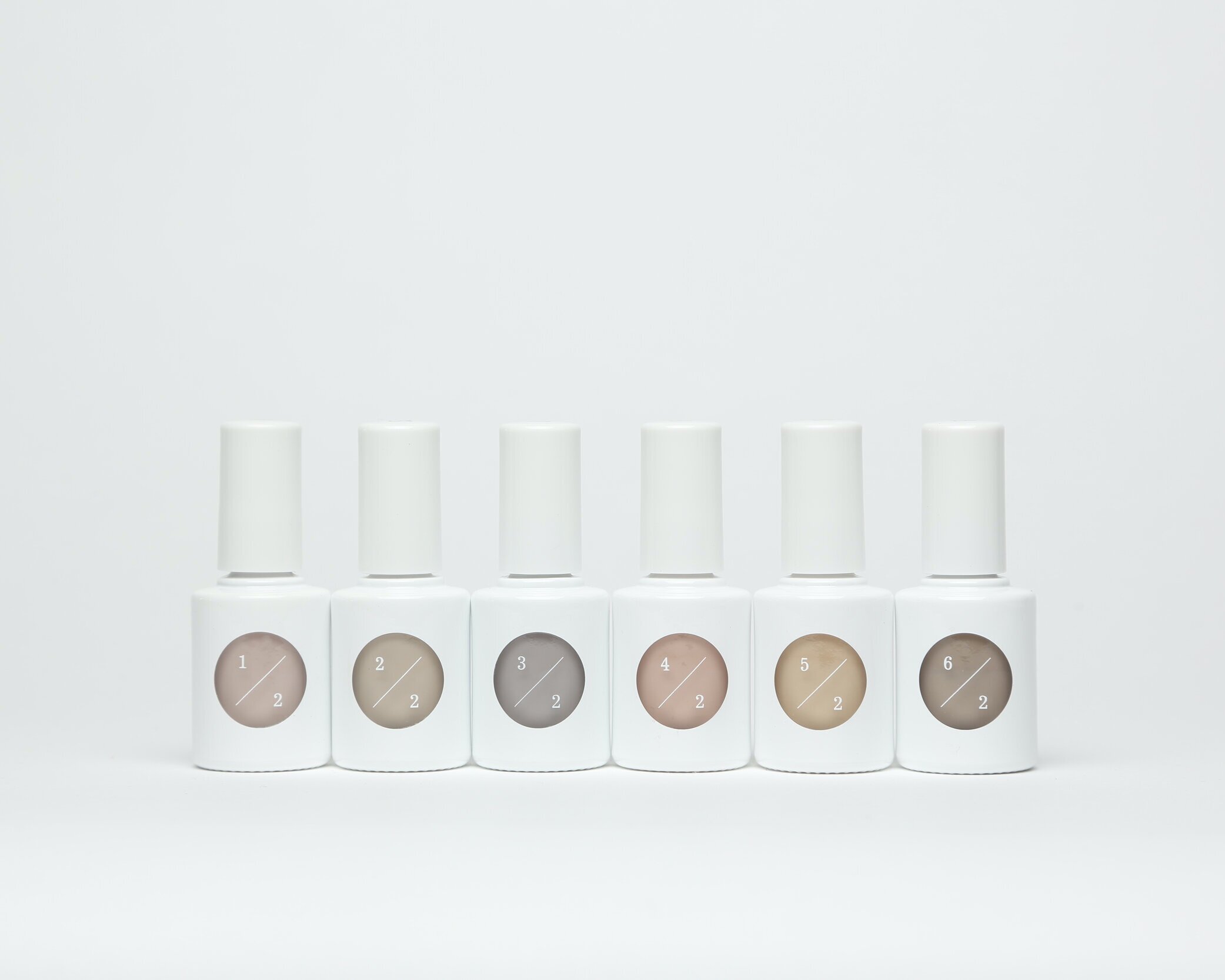
uka beige study two
Client: uka
Design Company: Allright Graphics
Creative Direction: Kiho Watanabe
Art Direction: Yui Takada
Design: Tomomi Yamada
Country: Japan
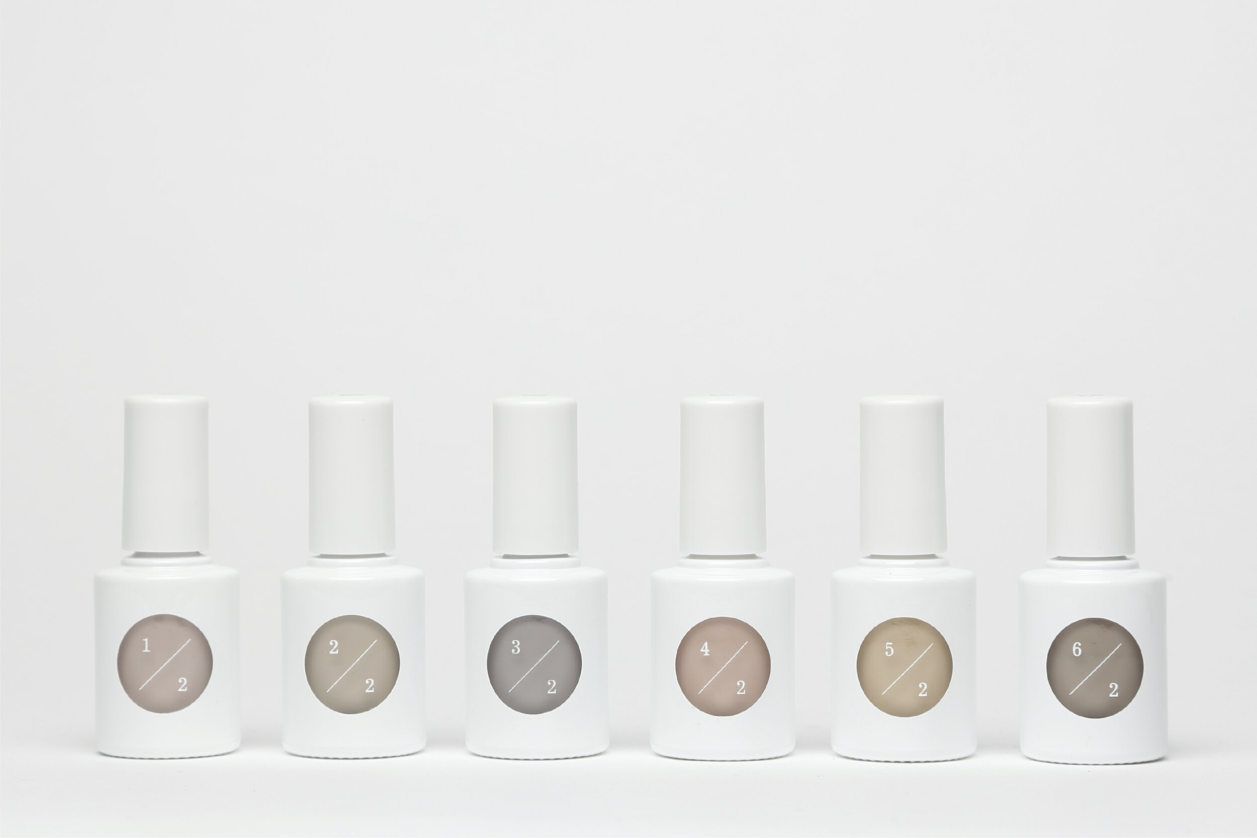
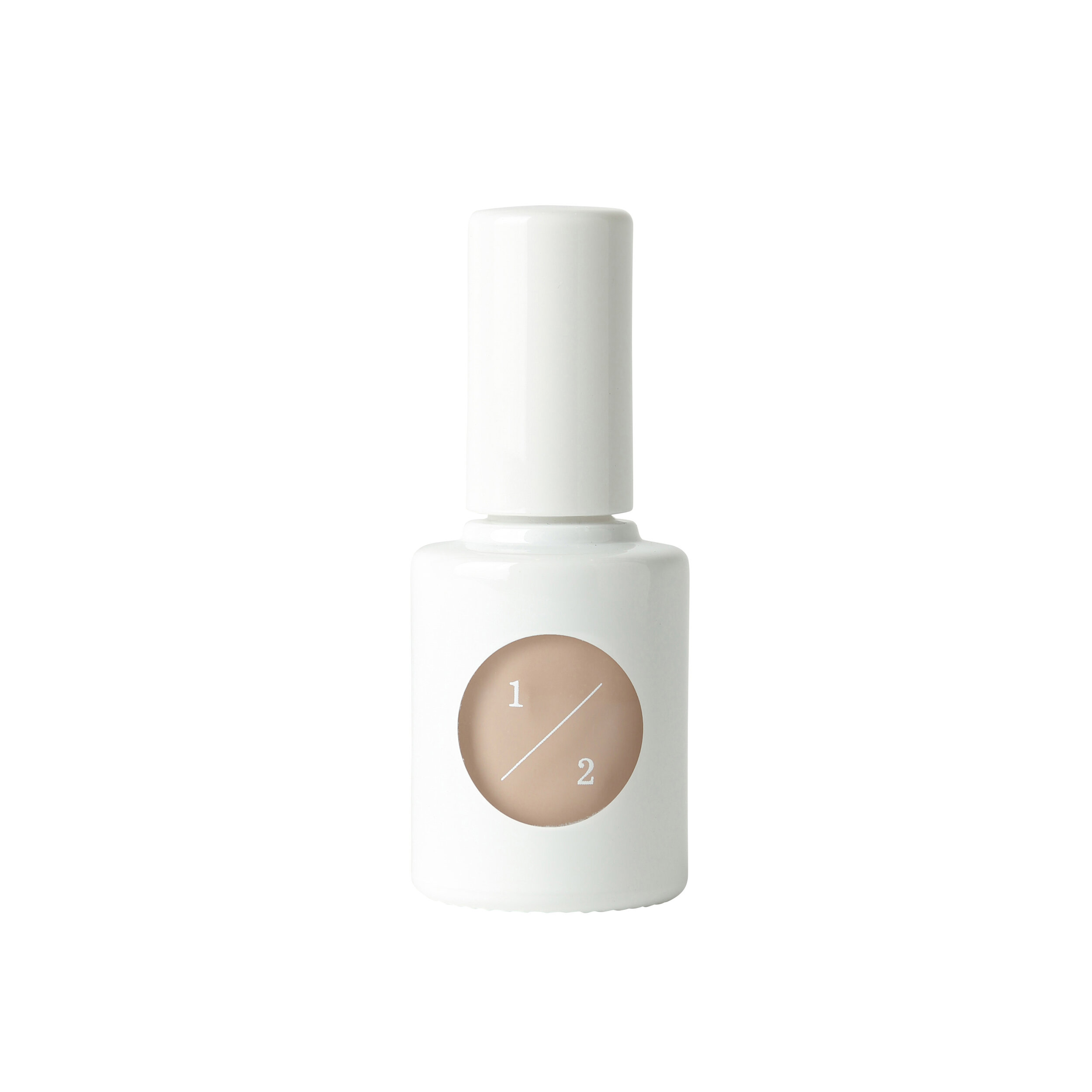
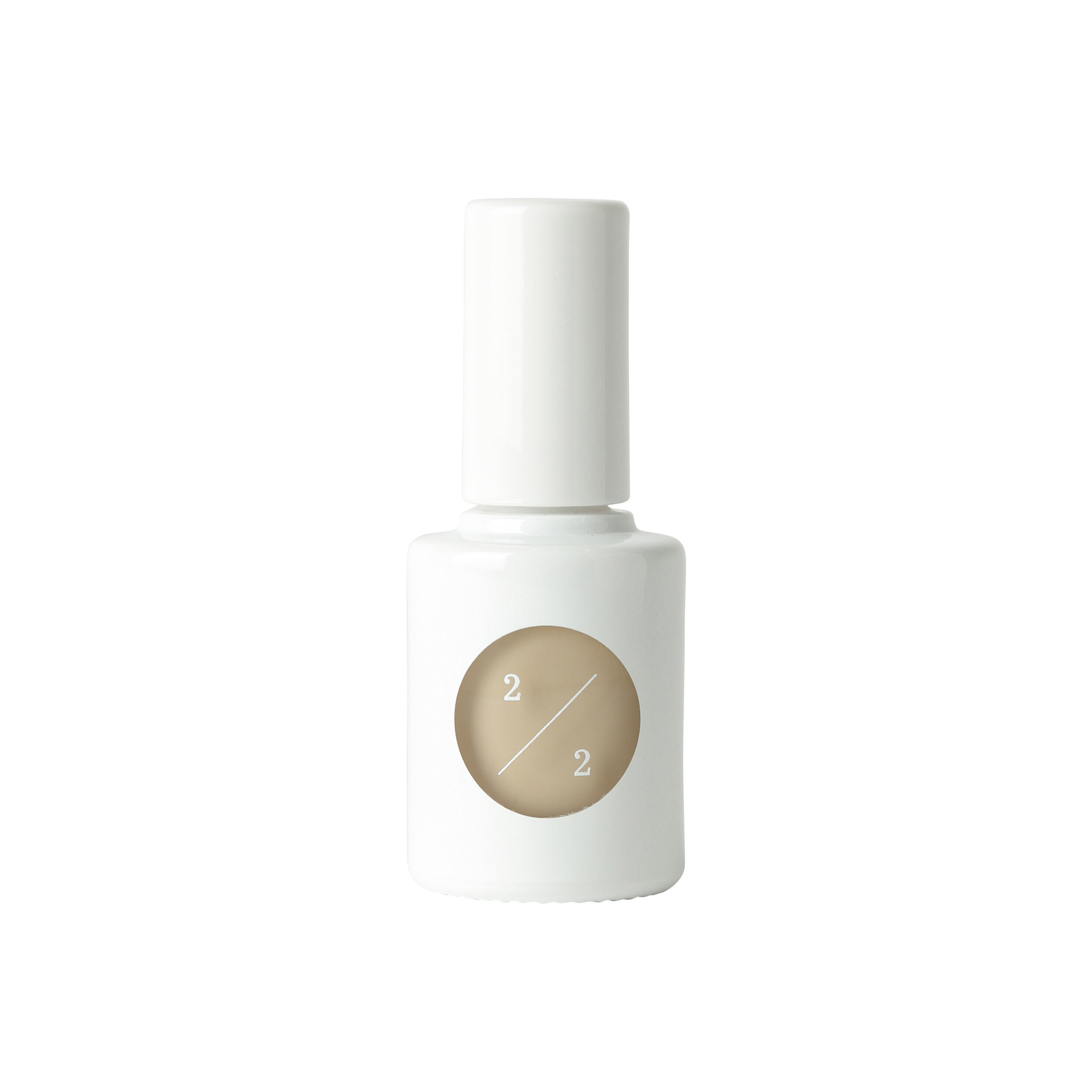
This minimal design uses uka’s identity: white, circles and numbers. “Study” is the product concept; a way for women to discover colors that suit them and their moods, and make them feel beautiful. Such applications convey the creator’s feelings of recognizing and supporting independence in women.
The product uses different shades of beige to enhance one’s dignity, cleanliness, naturalness and healthiness. Taking concerns like ‘you are only allowed to wear beige nail polish at work’ into consideration, we created this product which can be used in all environments and scenes. We believe your nails should be beautiful on its own, and as part of your hands. We hope you find your perfect shade of beige.
Digital Communication services, including website design, search engine optimization, social media, and content creation for nonprofit organizations, consultants, and creative entrepreneurs.


