Tofu Icchou


Tofu Icchou
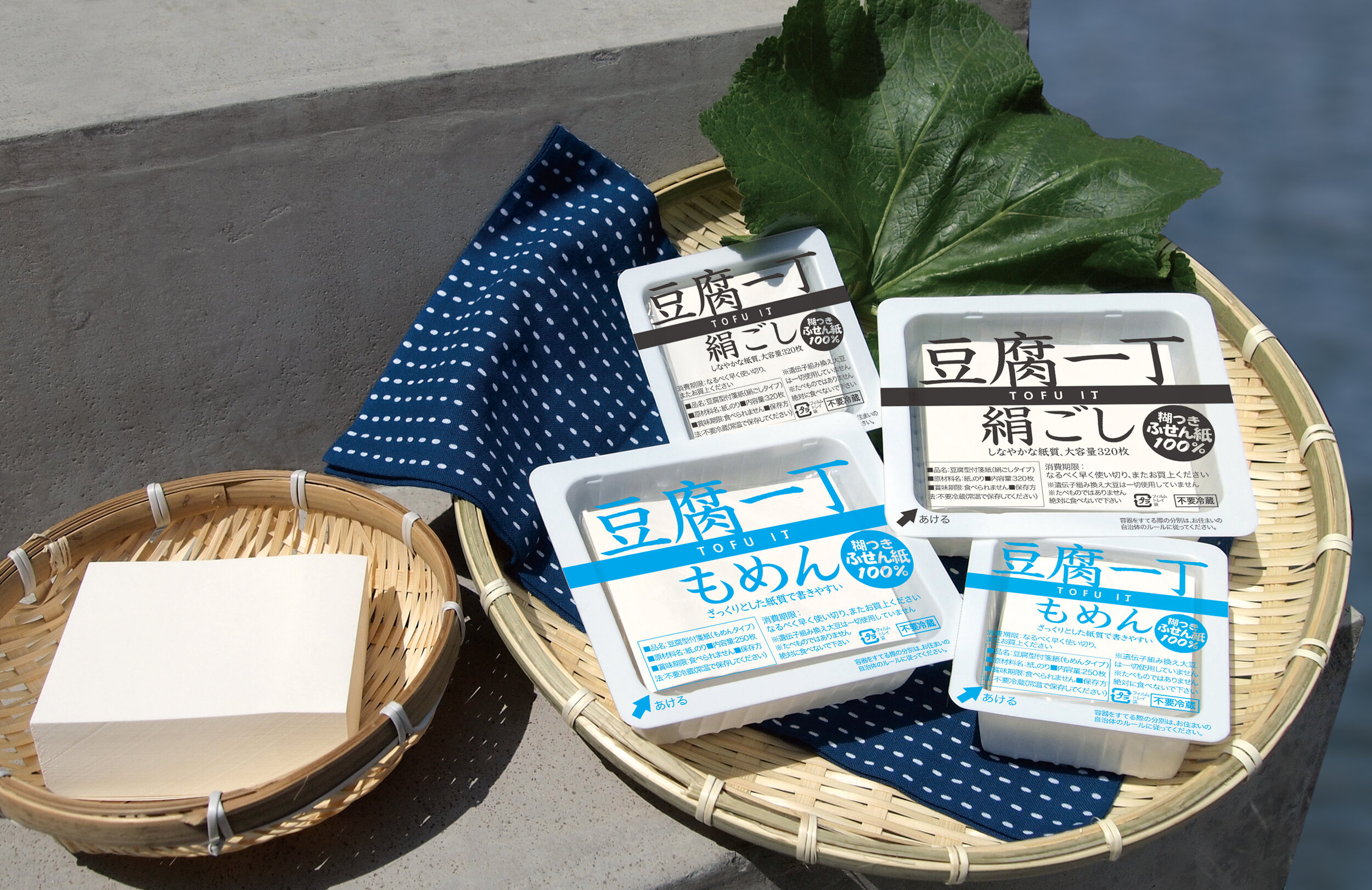
Full lineup: Tofu Icchou Momen/Kinugoshi (Sizes: Large, Small)
Client: GEO design inc.
Design Company: GEO design inc.
Creative Director: Satoshi Ogitani
Designer: Tadashi Isawa
"Tofu Icchou was made with the concept of bringing "surprises and smiles."
When the product launched in 2010, post-it notes had a serious image — in squares and in simple colours. Within this, "Toffu Icchou" kept the original functions of the post-its, but added "surprise" and "smiles" to it, becoming a key product in the humorous stationary boom.
Utilising the white of the paper in a square form, and keeping the simplicity by withholding any print; the outer appearance is just like a block of tofu. The graphics on the packaging conforms to food display standards as they would on a real tofu container.
The upper film can be opened and closed freely after opening the package; thus your colleagues will be "surprised" when they see a tofu on your desk, and will probably "smile" when they find out they are actually post-it notes.
The paper inside is fully considered to its last detail as well — the two types of tofu: 絹ごし (kinu, a softer silkier variety) and
もめん (momen, a harder variety where the water has been strained out) — are differentiated by the type of paper, where one has a silky touch, and the other embossed to create a rough and bumpy texture, completely changing the feel of writing on it.
Do something stupid in a serious manner. We think that because there's a great deal of detail and thought packed into the product, "Tofu Icchou" is loved and used by many people."
Digital Communication services, including website design, search engine optimization, social media, and content creation for nonprofit organizations, consultants, and creative entrepreneurs.


