Shiseido Parlour Western-Style Sweets Series





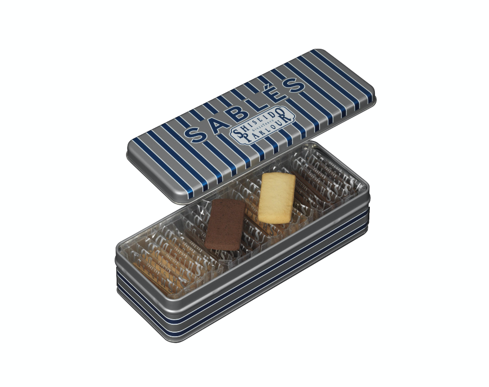
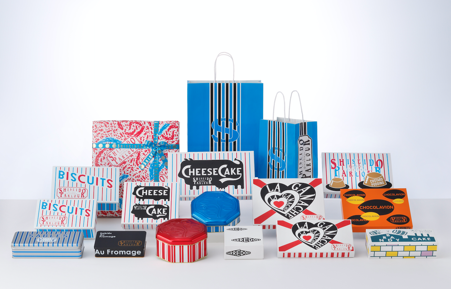
Shiseido Parlour Western-Style Sweets Series
Client: Shiseido Parlour Co., Ltd.
Design Company: Nakajo Design Office
Creative Direction: Shiseido Parlour Co., Ltd.
Art Director / Designer: Masayoshi Nakajo
Country: Japan
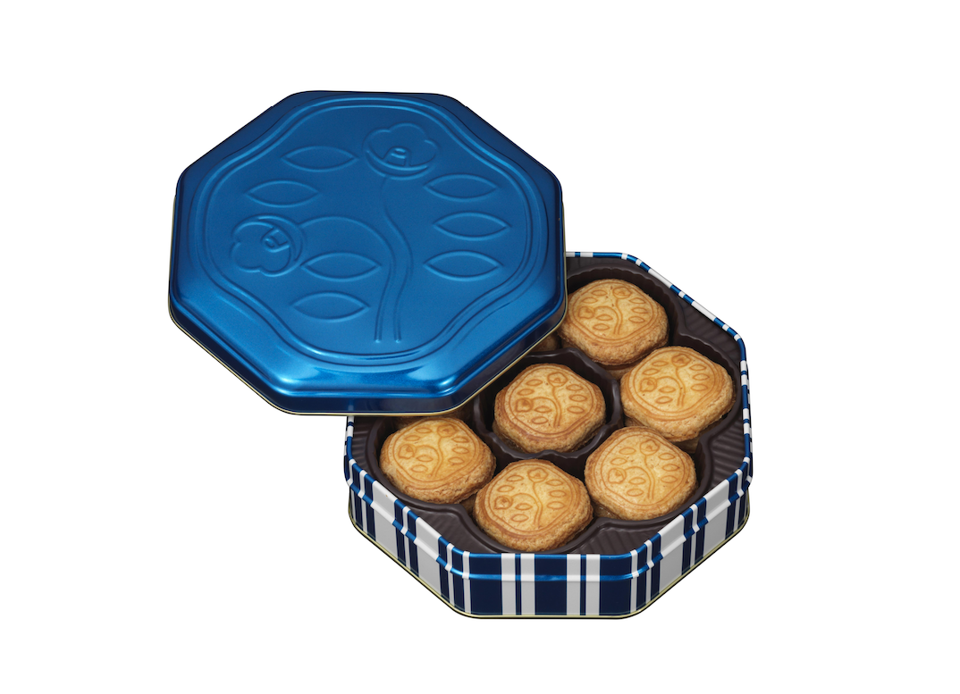
"In the year 1990, Masayoshi Nakajo's graphic design for Shiseido Parlour broke the taboo of using the colour blue for food, and created a stir.
25 years from then, in 2015, Nakajo renews the design that has now become a staple. This time, Shiseido put their thoughts forward for a design that has "a sense of Japan that they can proudly show to the world".
Ginza could be seemingly conservative with the number of long-established stores, so Shiseido created a design with the keywords "Ginza avant-garde", evoking Ginza's cutting edge nature that we have always embodied as the birthplace of fashion and design in modern Japan — the place that always coveted and took in new ways.
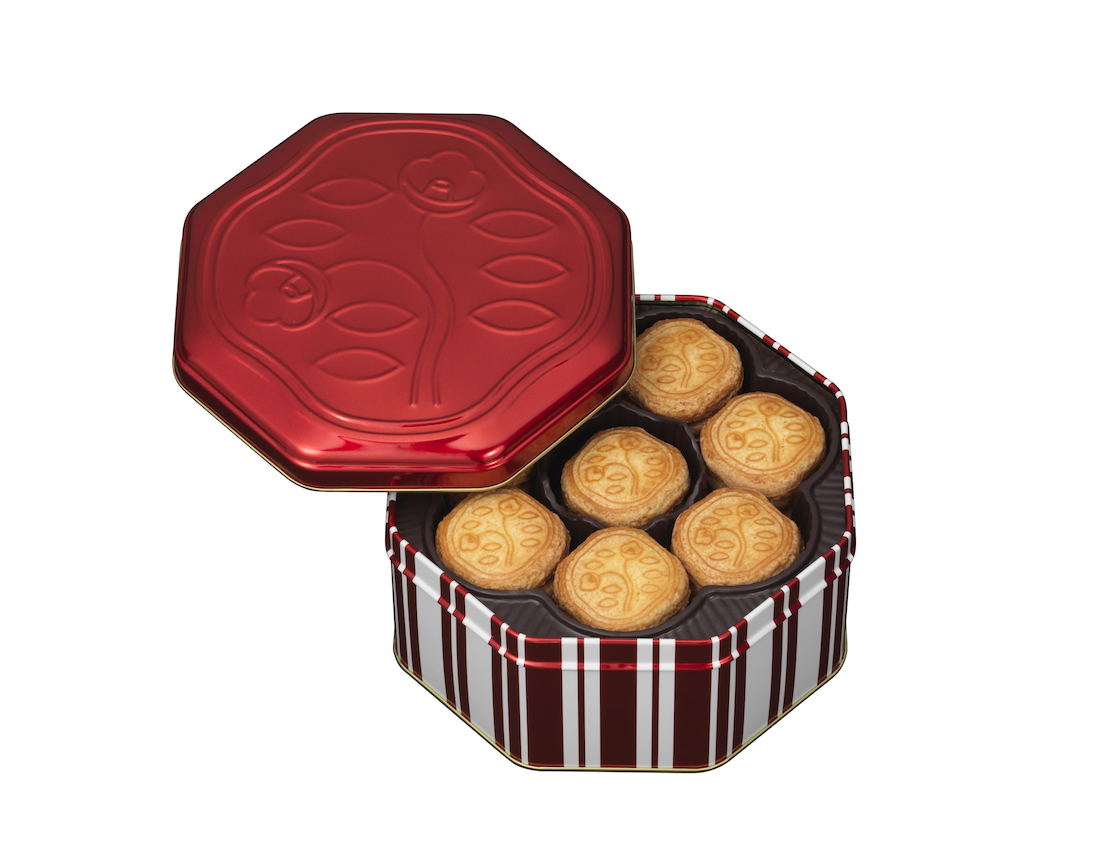
The key colours consciously appeals to our time now with a healthy and lively radiance — and comes in the three colours blue, white, and red. A black was added to the gold that was used from before, transforming it to a dynamic impression. And as the main structure that holds it all together; strong, clear, and timeless stripes were used for the pattern. Juxtaposed to this, we went back to the origins by incorporating the long used arabesque, and created a core with the clearly defined old and new.
The arabesque was modelled after one by Aubrey Beardsley, a prime figure in late 19th century art , and in 1924, Shiseido's design department designed a vivid wrapping paper to which Nakajo renewed. Nonetheless, it wears an old yet youthful feel, making one feel the breeze of a time when the design business was young and growing.
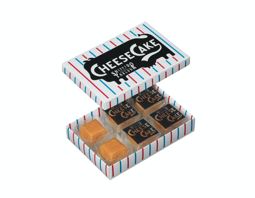
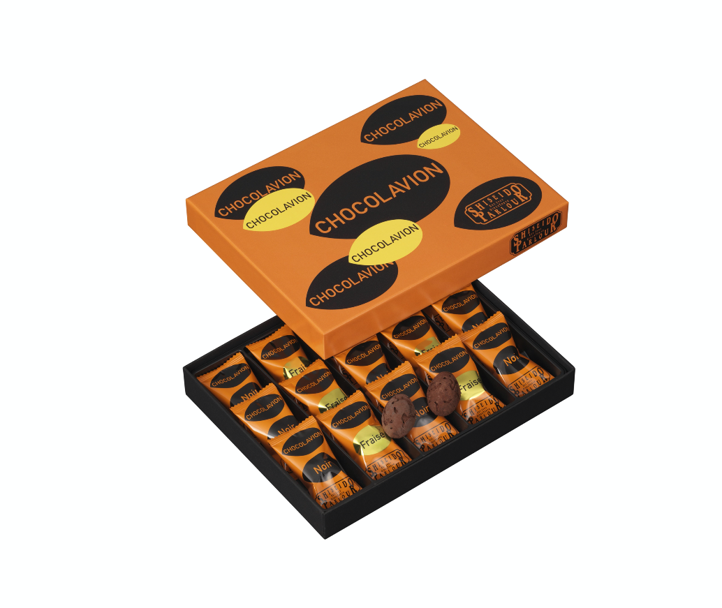
With these colours and patterns as a setting, motifs were used to emphasise the characteristics of each of the evolved and refined sweets. For instance, the cheesecake — which is popular standard — red and blue stripes on white, and is subdued with the dark silhouette of a cow. For the rich chocolate sweets, a chic heart within the white, black, and red colour scheme. The witty and bold graphics charmingly tells the story of each product.
Each holds a unique form; yet when viewed as a whole, builds on the mandala that communicates the unshakable value of Shiseido Parlour.
This is the kind of design that Shiseido Parlour and Masayoshi Nakajo proposed — a "Ginza avant-garde".
Full project name: SHISEIDO PARLOUR WESTERN STYLE SWEETS SERIES GINZA AVANT-GARDE (2015)
Digital Communication services, including website design, search engine optimization, social media, and content creation for nonprofit organizations, consultants, and creative entrepreneurs.


