KAGUA Blanc / KAGUA Rouge


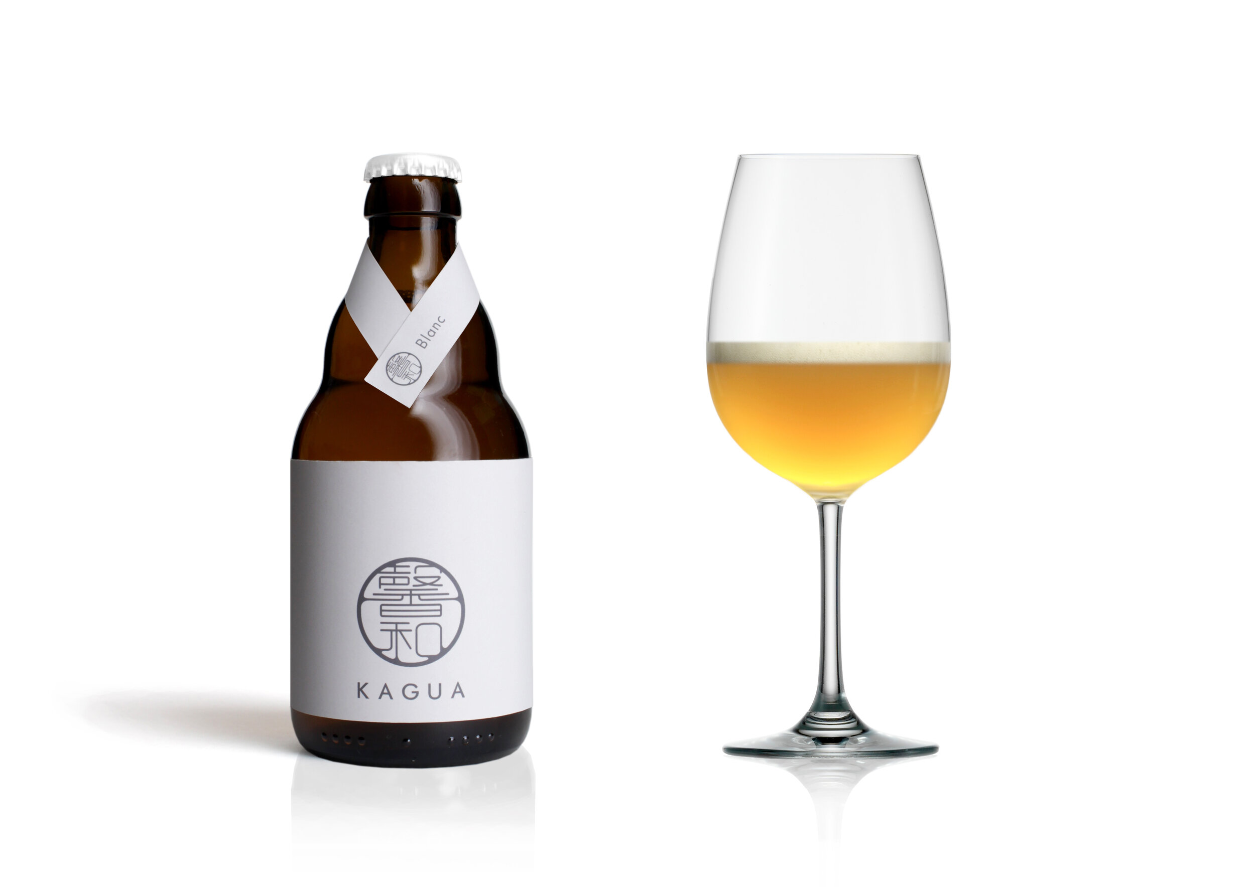
KAGUA Blanc / KAGUA Rouge
Client: Far Yeast Brewing Company
Design Company: HAGI STUDIO
Designer: Mitsuyoshi Miyazaki
Country: Japan
KAGUA's art director is a young, energetic artist working in Japan and internationally. His main aim is to create a simple, clean and well-honed image, while also reflecting Japan's gentle and meditative nature. He values the simplicity that accompanies any scene, the humbleness that complements any cuisine, and the dignified manner the label design conveys.
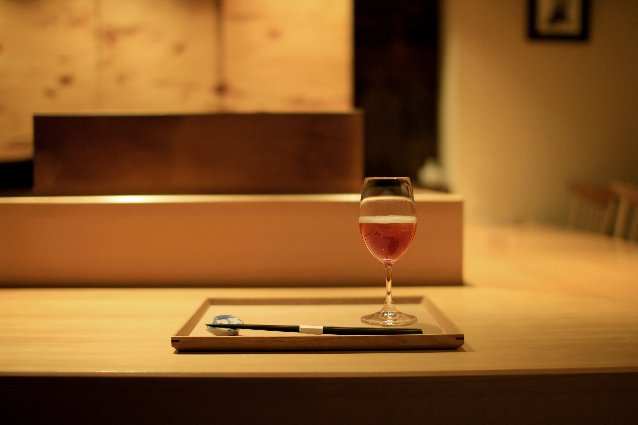
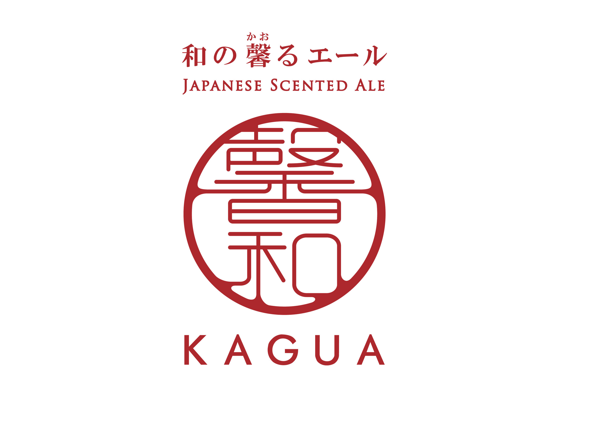
The designer explains, “I designed in the viewpoint that the appearance should be suitable for the occasions where KAGUA will be drunk. The logo is inspired by the traditional seal that the Japanese have used as a signature, in which I express KAGUA’s promise of the utmost quality.”
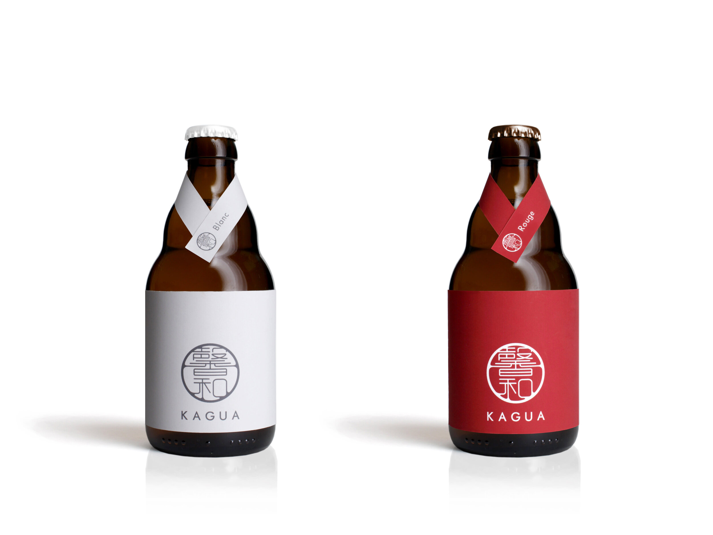
On the choice of colors, he explains, “I chose traditional Japanese colors for the labels, respectively. The red is ‘akane-iro’ [from the Japanese madder plant, a deep red] and the white is ‘gofun-iro’ [ultra-light yellow].
“I also projected the image of a Japanese woman who stands modestly onto the bottle’s necktie, by likening the necktie to the collar of a kimono.” The designer concludes, “I hope KAGUA complements the scene at the most splendid tables in the world.” — Mitsuyoshi Miyazaki
Digital Communication services, including website design, search engine optimization, social media, and content creation for nonprofit organizations, consultants, and creative entrepreneurs.


