Hanahzo


Hanahzo
Design Company: Hanahzo
Designer: Han-ah Jo
Country: South Korea
Find out more through: www.hanahzo.com
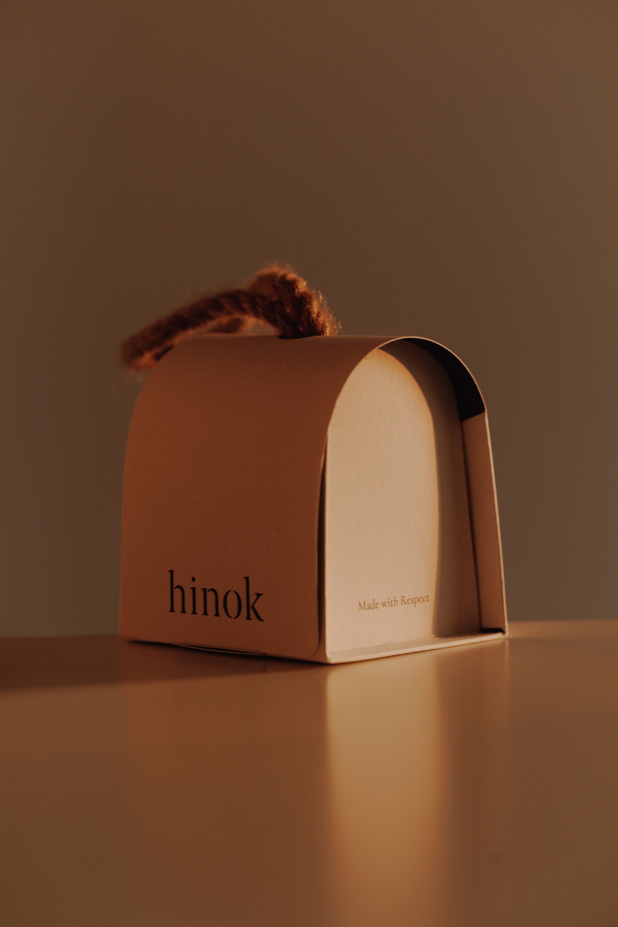
"Hanahzo's white package symbolizes pureness, cleanliness and white square tiles.
The color of the soap that looks like a window in the package of soap.
It expresses the true relaxation hidden in the bathroom.
When the package is expanded, it becomes a flat rectangle.
We avoid inefficient packages that inflate the product.
So I tried to design as close as possible to the product."
Hanahzo is a living brand with the motto of "PAUSE YOUR LIFE".
The first project is making a break in the bathroom.
The first item is soap. Every soap has a story about rest.
The photo soap is the 321 series. This collection was launched on March 21, 2015.
I opened an exhibition with the opening of the workshop on the subject of "Waiting for Spring". It also contains the meaning of "three, two, one" when counting down.
The soap was created by expressing cold winter in marble and warm spring in pastel colors.
The warmth of spring when I wait.
It is a collection made with the desire to be able to feel the warmth in the bathroom."
Digital Communication services, including website design, search engine optimization, social media, and content creation for nonprofit organizations, consultants, and creative entrepreneurs.