dear mayuko
dear mayuko
Client: Dear Mayuko Co., Ltd.
Design Company: Daikoku Design Institute, Nippon Design Center, Inc.
Art Director / Designer: Daigo Daikoku
Designer: Mayumi Sano
Copywriter: Ryoko Kawahara
Photographer: Mikiya Takimoto (Product shooting), Kei Iwasaki (Shop shooting)
Shop Design: Koichiro Oniki
Promotion: Tatsuki Suzuki /Youko Tsuruta / Michiko Inagaki
Country: Japan
Find out more on: Daikoku Design Insitute, his Facebook
and dearmayuko
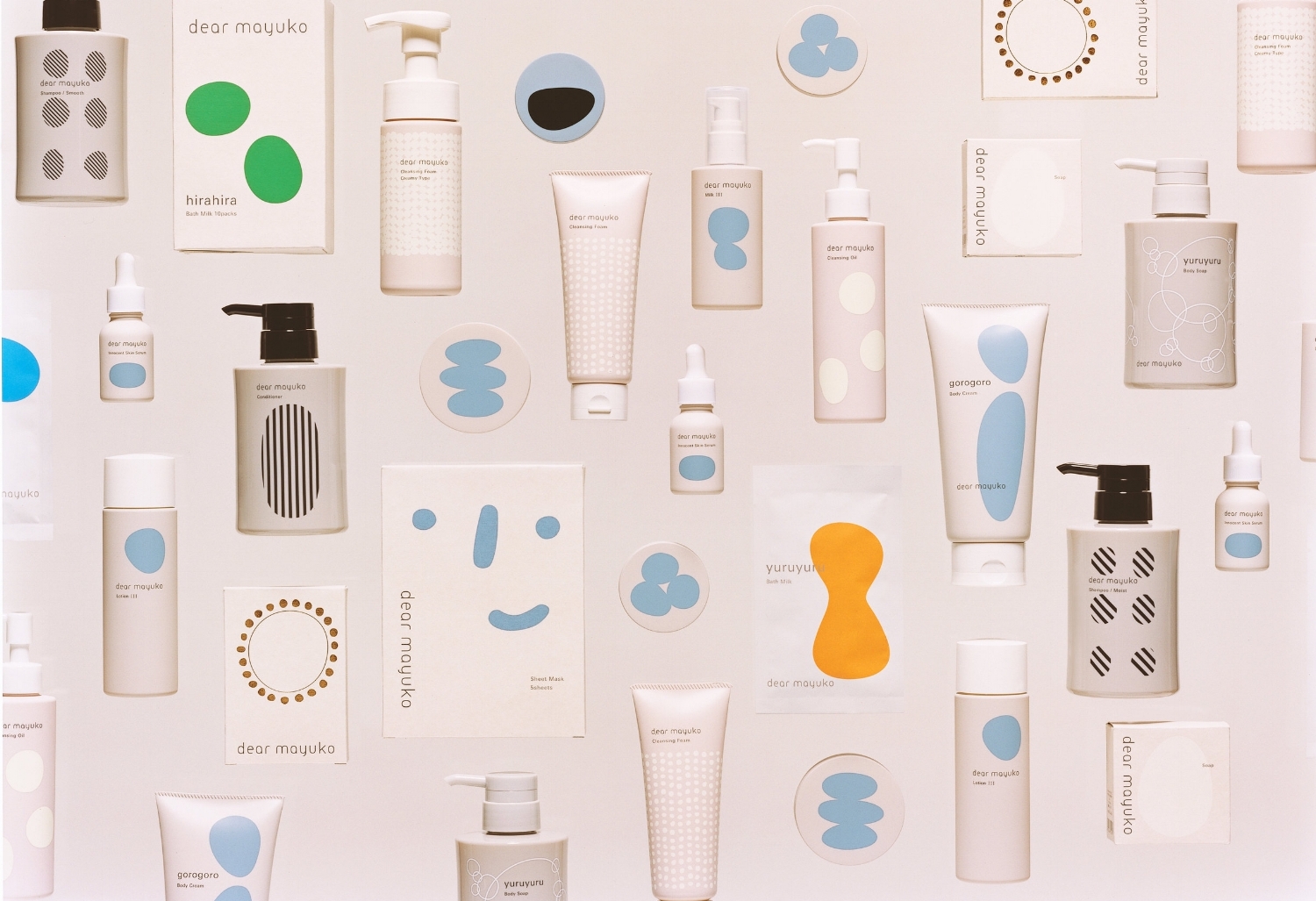
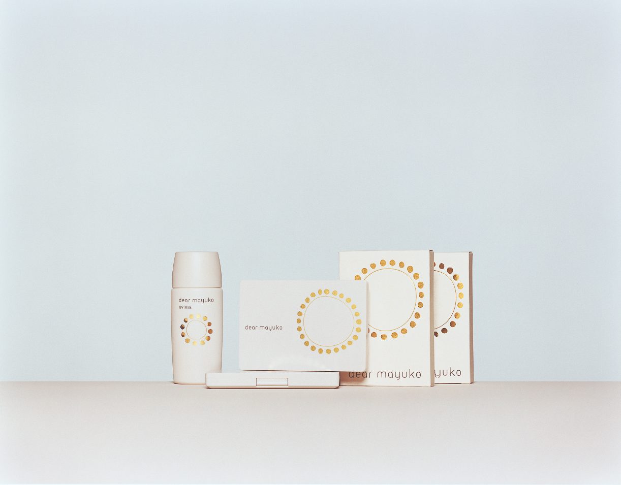
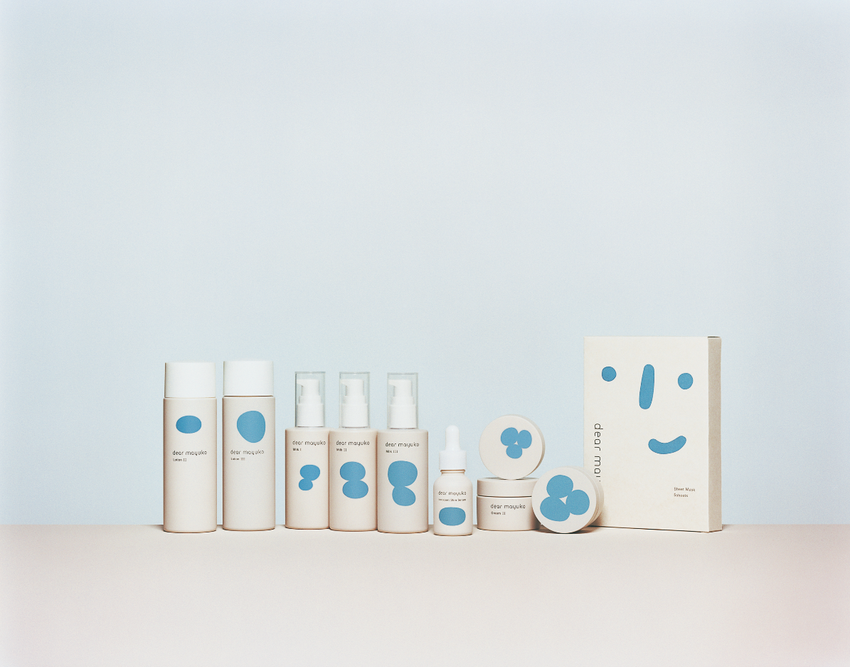
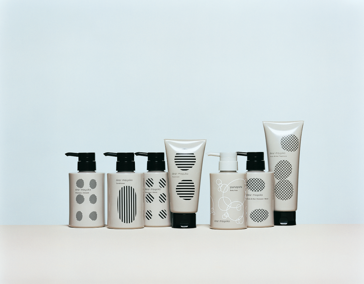
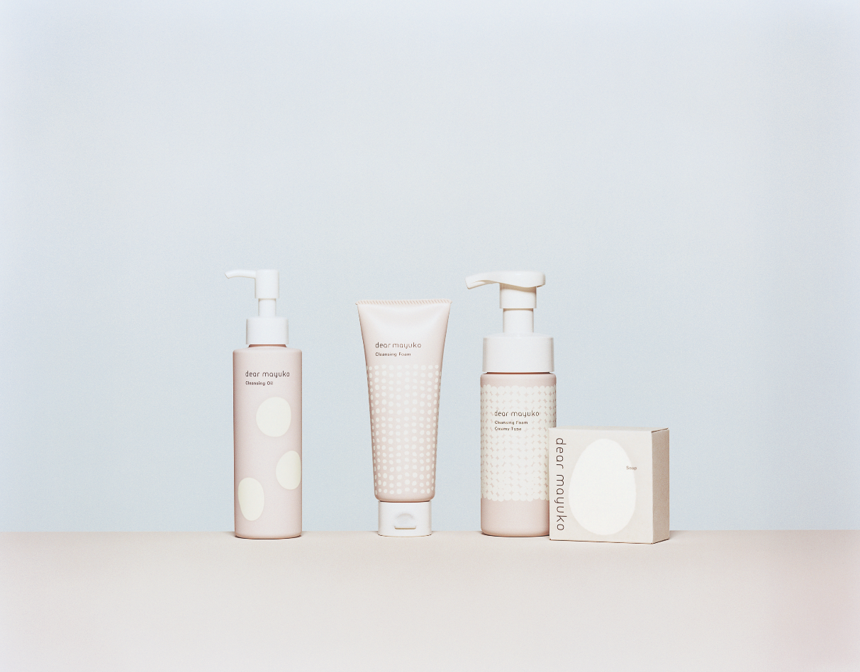
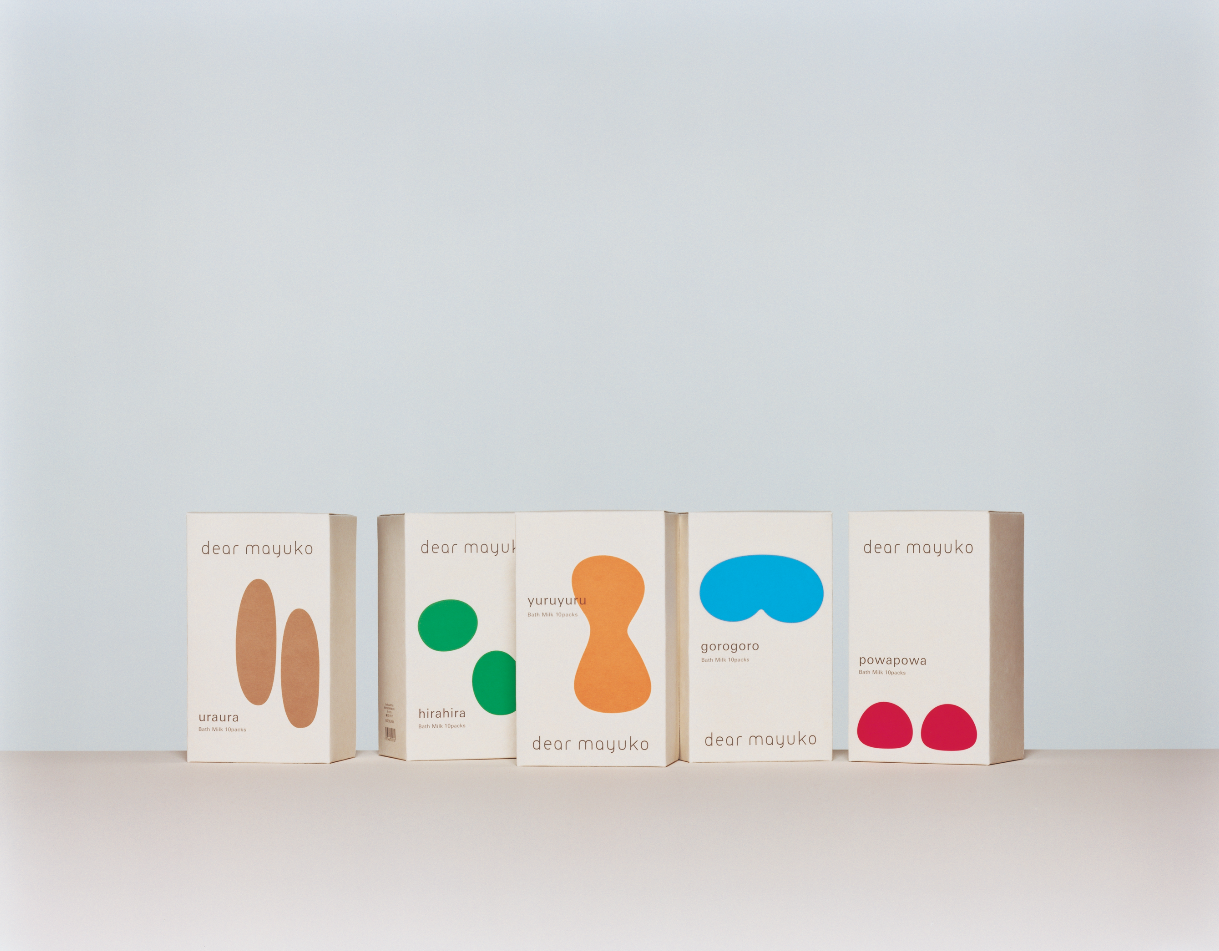
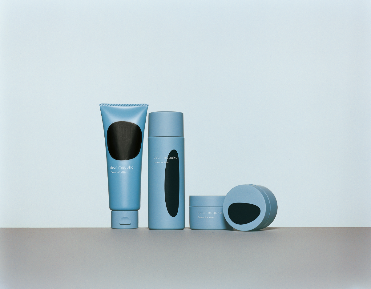
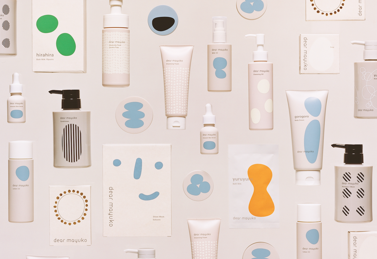
"dear mayuko is a beauty brand that suggests a new lifestyle, featuring sericin — a moisturising ingredient found in cocoons (繭 "mayu" in Japanese). We've dedicated the concept "Wrapping oneself in bliss" to communicate its uniqueness. Taking the cocoon's circle as a basis for the logotype, the package design uses the circle as a motif as well. The product itself — fluffy, bubbly, slippery, and smooth: these feelings were visualised through various forms of the circle. As for the store design, modularised tiles are used as a backdrop for the main bath products. With a focus on "sweet, simple and strong", we worked on making a brand that can be lovingly used for a long time."
Digital Communication services, including website design, search engine optimization, social media, and content creation for nonprofit organizations, consultants, and creative entrepreneurs.