ANTI-ACNE SKINCARE
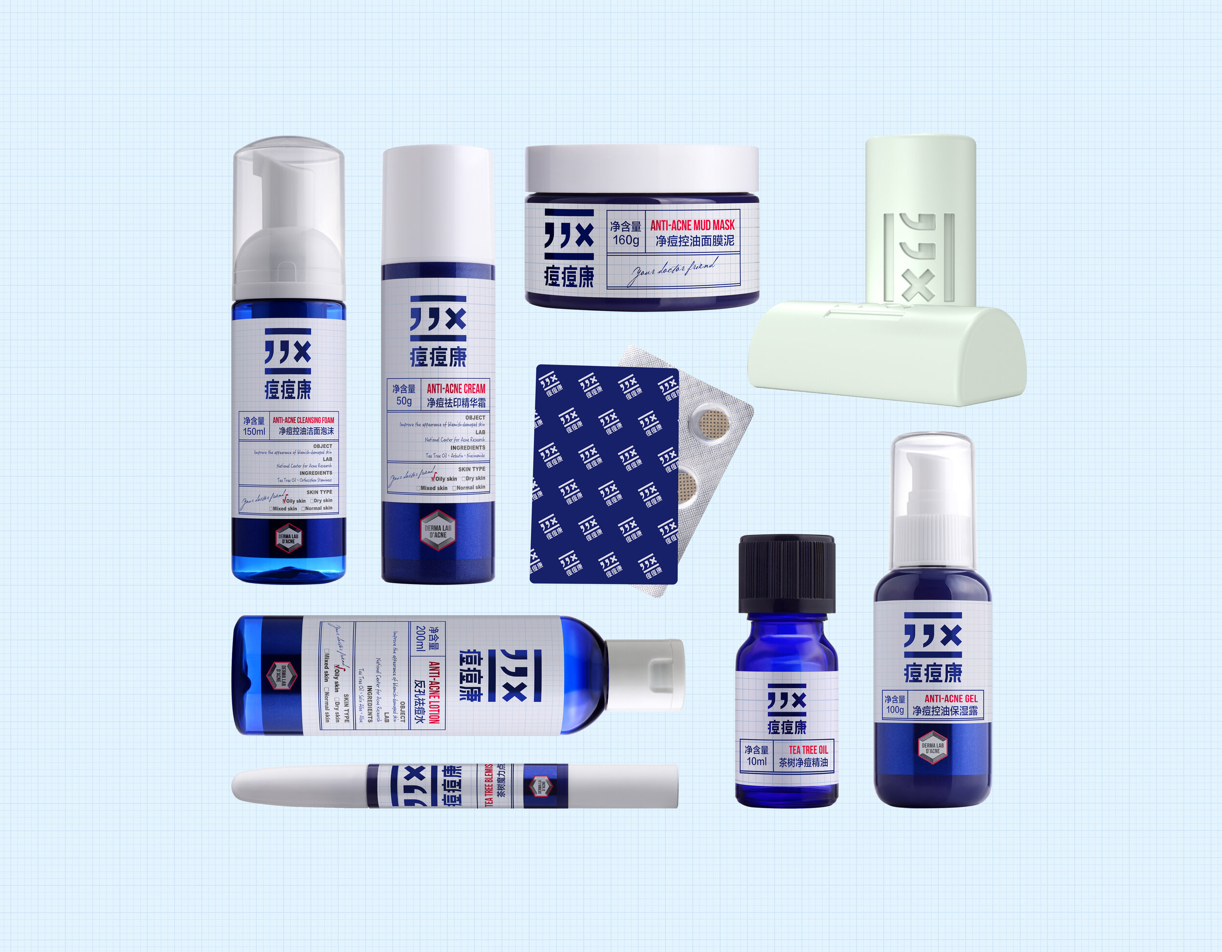
Anti-Acne Skincare
Client: DOUDOUKANG
Design Company: NX CREATIVE
Art Director: Guozheng Jiang / Dandan Chen
Designer: Yue Ni / Qiurong Ji
Country: China
"Doudou Kang (doudou is the pronunciation of acne in Chinese) is a brand providing professional acne treatment for young students group, with professional and medical skincare products. Its main retail channels are pharmacy and hospital.
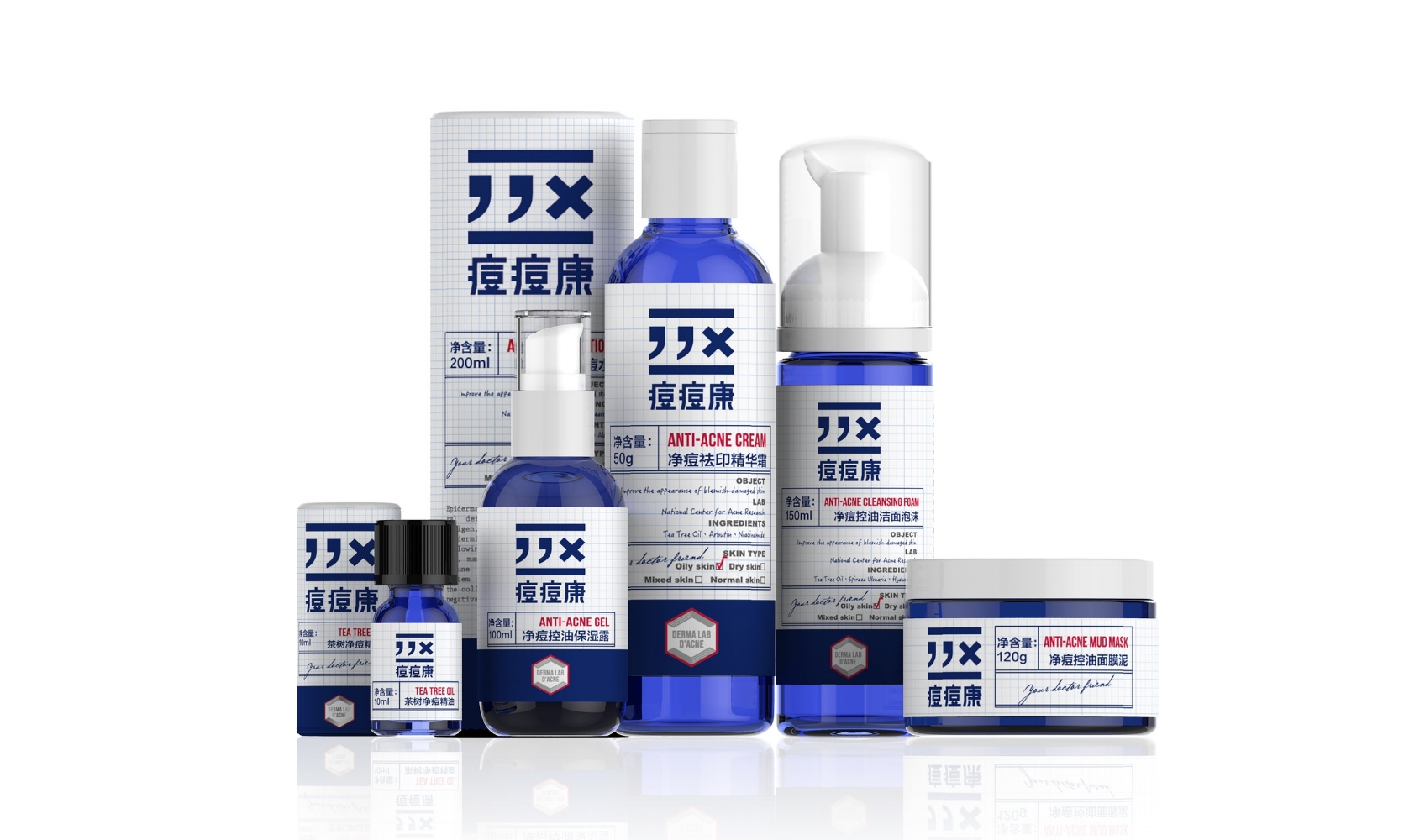
Based on research on our target group, we found that 90% of users are young students aging 16-22 years. However, the packaging of products are rational and formal with slight difference with regular medicine, due to character of its retail channel.
As the channel expansion to pharmacy, our customers obtain more freedom in consumption of this products, which requires a stronger spiritual connection in our product image with our target consumers. With such consideration, the core mission in redesign of our product is to BALANCE: being professional while still have fun for our target consumers.
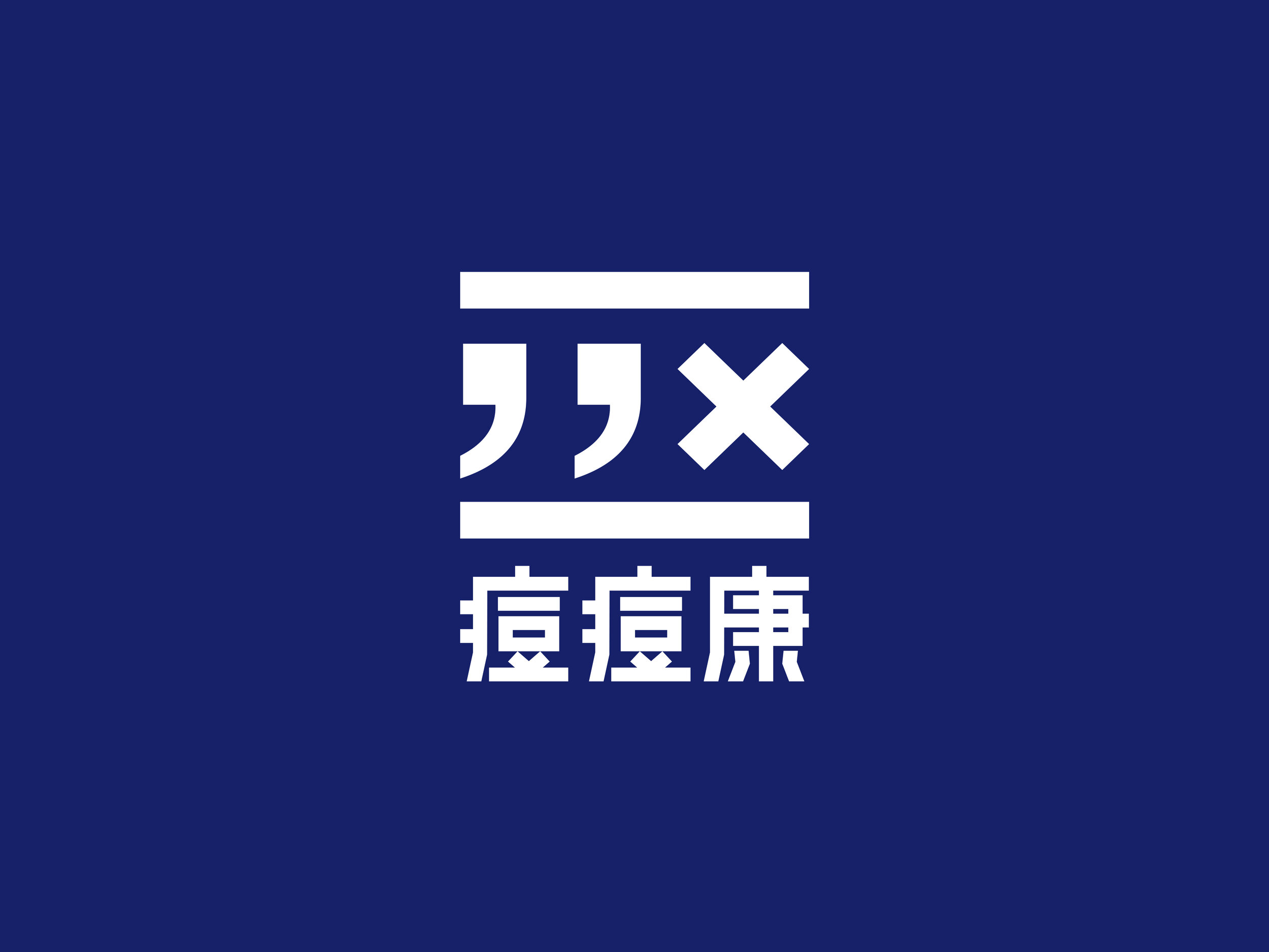
Acne in Chinese pronunciation is “dou”, same as that of comma “,” in Chinese, which inspire us to create a logo: “,,X” while the “X” stands for “REMOVES”, making it more easy recognize and spread.
Label: we create a lovely demonstration of a real doctor prescription, with the handwriting note (from a doctor) to emphasize the product USP. And this is delivering more entertainment, differentiated with the former appearance of dullness.
Packaging box: we design a cylinder paper box, student can use it as a pen container, and bring it to the school, class, library and dormitory etc, in order to have more and continuous spreading in the target group."
Digital Communication services, including website design, search engine optimization, social media, and content creation for nonprofit organizations, consultants, and creative entrepreneurs.

